Plasto A New Character Design for The Sustainables Academy

This fellow is a happy chap and he’s also one of the Sustainables. This character forms part of a range of illustrated characters created for a exciting range school resources to educate on environmental issues and matters of responsible consuming. Plasto represents plastic use and recycling and as you can see has a bendable and stretchable physicality to him.

Clients wanting to commission usually present an idea and from that a conversation and then rough drafts follow to develop the idea further. I’ve attached a later pencil draft to show what a final concept looks like and how closely it looks to the final presented to the client.

Narrative Storytelling And Working With Schools

I’ve recently been working with secondary school pupils at St Brides School in East Kilbride with Magic Torch Comics. For this project we are taking excerpts from children that fled Germany in the 1930’s and relocated to the UK.

Key to the learning is to allow the pupils to find their own way through the story and share my experience of illustrating graphic novels. To get them infer from a story’s text, what else could be said and making their own choices in how to best visually tell the tale. .

The short version of Isi Metzstein’s account of how he experienced Kristallnacht was prepared to work with. The two pages you see here have been inspired in part from the classes own work. In my most recent session with the class my two pages inspired from the collaboration was presented to them for feedback.

As the project progresses I will be creating the full version of this story and a another by Dany Metzstein. These stories told as visual narratives will be an important part in telling these important stories to younger people.

Both will be available to read for free at Magic Torch Comics for schools and anyone else interested.

These interviews can be found here and tell of the horror inflicted on these young lives.

Four pages to tell a tale.

This nice little 4 page comic was commissioned by Magic Torch Comics. The story I illustrated, Calasraid was part of an anthology of tales. Colourful art, action with a bit of silliness masks a darker story that has brutal ending. Read this story and many more for free at Magic Torch Comics

Creating Graphic Novel Artwork

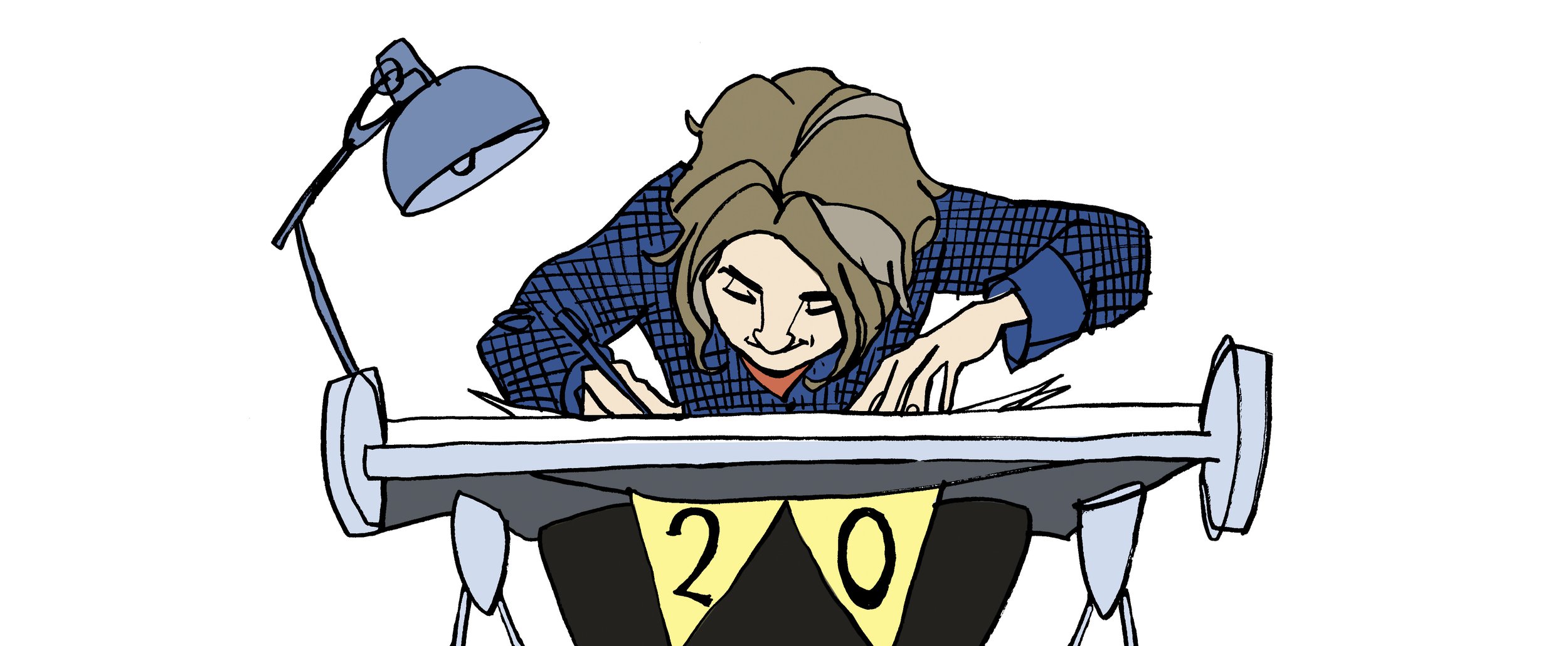
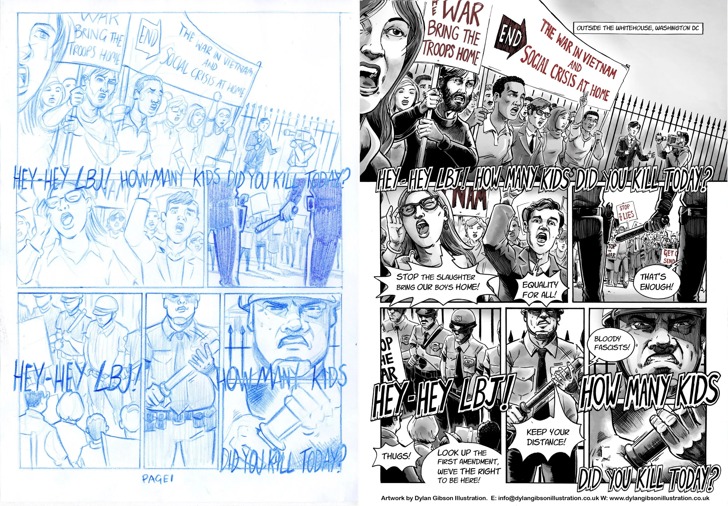
Telling a captivating story with pictures is a love of mine and I’m always thrilled when I get a commission to create illustrations for a new visual narrative. The draft and finished page below has been taken from Goliath a story set in 1967 and the year 2000.

As much as I hate to admit it the year 2000 is now firmly in the past and this novel is essentially two period pieces within one story! So the look of both times needs researched and delving into the past to get the look and feel right can be it’s own time consuming rabbit hole if you let it. You get an immediate satisfaction if you get it right. I think the trick is not to pick out too many obvious examples from the period as this especially in the case of fashions can make the feel characteristic.

First I start by reading the story, I let it percolate a bit in my mind and play it out in my imagination like a film, thinking composition, point of view and pacing. I try to trust my intuition and find that if it feels easy to draft down on the page then I’m doing it right. After I might go back into it and do a little refinement before illustrating the final page.

I still draft my rough pages by hand and you can see I have a love for using colour pencils. This draft stays very close to the final page, you will see a little refinement here and there only. The finished art is hand drawn in pen & ink then scanned. I use a layer with textured paper to help soften the shade I add to give it a wash, water coloured feel which I think helps adds to the period look.

I used greyscale with some colour to highlight elements for the 1967 time period and used colour for the year 2000 parts of the story so the reader knows when exactly they are at a glance.

Goliath. Draft page and Finished art comparison. All my illustrations are hand rendered in pen and ink.

KA-BOOM! Superhero Team Character Design!

Another of my character designs for Sustainables Academy, this character named Shatter is made from glass and she informs learners about glass, how its made our use of it and the importance of recycling and cutting down its use.

I wanted to avoid cracks or sharp or broken glass elements to her look, as you can imagine a broken glass look would not go down well in a classroom! When coming up with her I though more about glass and the shiny polished look of glass bottles. As with all the Sustainable characters they are guided by a nineties cartoon series look and hopefully that comes across in the style of Shatter.

Shatter in all her Nineties style glory! Original character created in pen in ink.

Shatter with The Sustainables Team.

Whats on the box

When we read our imagination takes us further, it will fill in and create extra depth and meaning to the story we're reading.  An illustrators job is to visualise those imagining and deduce what might be going on in a scene or character interaction that isn't described in the authors words.

When creating illustrations for a story, I very much focus on the process of developing what my imagination is telling me to the page.   I'm always keen to make suggestions and develop ideas that can help enrich what the author has written. 

This scene was created to show how the children in the story bond with the robot, originally it was supposed to be a dinner table scene, though as robots don't eat it highlighted the difference of him as a character and separated him from the kids in the story.  Instead I fleshed out this scene with them all watching something scary, so that a bond is created by their share experience.  

This artwork was created by hand using pencils, scanned and layered and painted on Photoshop 

This artwork was created by hand using pencils, scanned and layered and painted on Photoshop 


Follow the balloon, drawing is fun

Illustrating an artwork is fun and the enjoyment should reflect in what the final artwork looks like.  You can really get a sense of enjoyment in creating a scene, a snippet from life rendered on the page.  For this illustration I really enjoyed capturing in ink the types of character you might see in in a line up, different ages, clothing styles and mood. 

As you can see I like economy in the line, keeping it simple and bold and easy to read. This was for a double page editorial illustration with text to be added on top. It also came with a background variartion showing the scene in context at an airport. 

Crowd Dylan Gibson.jpg
Dylan Gibson Illustration Longhaul.jpg

High Seas Adventure

Illustrating a children's story is a joy and a learning experience for me, the process of developing the visuals from character, concept layout to finished artwork creates opportunities to develop my existing techniques or learn new ones.  This process I hope ultimately rewards the reader and fully realises the author, publishers and my own vision.  

I think its very important not to get to caught up in my own style and allow flexibility in my approach as openness and the wiliness to try new ideas can also refresh what you can do as an artist. 

Below is a little example, this illustration was created to primary focus on the characters on board the pirate ship, giving space to each personality.  The children's book artwork was rendered in pencil, I played around with layers adding paper textures to give a watercolour style texture to the colour. 

High Seas Adventure, Dylan Gibson Illustration

  Please get in touch if you have any questions or would like to be sent samples. 

Illustration Friday

Cover illustration for Halloween Bandits a Lawrence Pinkley Adventure. Illustrated in pen and ink using brushes, art pen, brush pens

Read More

Drawing On Glass

Normally I hit the drawing board when doing an illustration, using paper, whatever weight or type that suits what I’m using to make a mark on it. 

Drawing on a window is a little bit more tricky and to get it right I plan out first what I’m going to draw on it.  Starting like I would in any commission I sketch my ideas down and create a layout on paper so I’ve got a good guide before I illustrate on the window.

Getting started on Café Calluna’s windows for The Enchanted Forest.

Getting started on Café Calluna’s windows for The Enchanted Forest.

Normally when you stare down a page to begin an artwork all you get is that big white surface filling your view and challenging you to make your first mark.  With a window you struggle with the view ahead, people passing, reluctantly featuring in someone’s selfie with you drawing in it, incidents of road rage and an endless procession of delivery vans. Life passes by and occasionally interacts if you stir a person’s curiosity.  My work for me is normally in a comfort zone and a place where you don’t get that kind of distraction but its so much fun to get out there.  That’s why opportunities to draw in public with window illustrations or chalk art and even live drawing are so great to do.  A chance for real time feedback, sharing my skills and observations. 

Give me some chalk pens and a window to draw on.

Give me some chalk pens and a window to draw on.

Any live drawing event whether it’s in a meeting room fleshing out an idea on paper with a client or in a conference hall recording an event with illustration is a great opportunity for an artist to stimulate and push their skills and share with others.  Making creativity a shared and more interactive experience is a wonderful thing to be part of.  

WIndow at night.

WIndow at night.

A Tricky Scene

Imagine a robbery at a newsagents and all manner of scary thoughts cross your mind, the potential for someone to get hurt, weapons, dangerous assailants and theft.  When illustrating a scene like that in a children’s book you have to step carefully.   Even when the tone of the book is funny you have to consider making the scene look dangerous and dramatic without having the illustration look too violent or scary.  At the same time you have to give the artwork a little edge as to not belittle how terrifying a robbery can be.  Performing a illustrated balancing act worthy of a trapeze artist starts with laying out the essential elements from the story and composing a layout. 

Creating a good concept illustration is key to developing the right tone and I’ll do that by taking a very rough sketch and using layout paper just go over it again until I get character, composition and tone the way I want it.   Getting it right at this stage means no later disappointment from the publisher by keeping the intention of the approved signed off concept in line with how the finished image will look like.

My Pen and Ink illustration for the Halloween Bandits

My Pen and Ink illustration for the Halloween Bandits


For my robbery scene, illustrated in pen and ink, I added in a few bystanders, a man protecting his dog, and a boy next to a jar of lollipops.  It really helps of course that my robbers were wearing Halloween masks and that alone helps keep the look fun, dramatic and not too scary. 

Illustration Friday

The theme to this week's artwork on Illustration Friday's weekly competition is vintage and my illustration submission is a baseball player done of course to look a bit vintage complete with a big old fashioned tash.  Pen & ink illustration rendered by hand and then layered up and colour added on Photoshop to give it a nice grainy look.  I wanted to get a nice bit of movement and perspective in the run up and throw in my character design.