Whats on the box

When we read our imagination takes us further, it will fill in and create extra depth and meaning to the story we're reading.  An illustrators job is to visualise those imagining and deduce what might be going on in a scene or character interaction that isn't described in the authors words.

When creating illustrations for a story, I very much focus on the process of developing what my imagination is telling me to the page.   I'm always keen to make suggestions and develop ideas that can help enrich what the author has written. 

This scene was created to show how the children in the story bond with the robot, originally it was supposed to be a dinner table scene, though as robots don't eat it highlighted the difference of him as a character and separated him from the kids in the story.  Instead I fleshed out this scene with them all watching something scary, so that a bond is created by their share experience.  

This artwork was created by hand using pencils, scanned and layered and painted on Photoshop 

This artwork was created by hand using pencils, scanned and layered and painted on Photoshop 


High Seas Adventure

Illustrating a children's story is a joy and a learning experience for me, the process of developing the visuals from character, concept layout to finished artwork creates opportunities to develop my existing techniques or learn new ones.  This process I hope ultimately rewards the reader and fully realises the author, publishers and my own vision.  

I think its very important not to get to caught up in my own style and allow flexibility in my approach as openness and the wiliness to try new ideas can also refresh what you can do as an artist. 

Below is a little example, this illustration was created to primary focus on the characters on board the pirate ship, giving space to each personality.  The children's book artwork was rendered in pencil, I played around with layers adding paper textures to give a watercolour style texture to the colour. 

High Seas Adventure, Dylan Gibson Illustration

  Please get in touch if you have any questions or would like to be sent samples. 

Illustration Friday

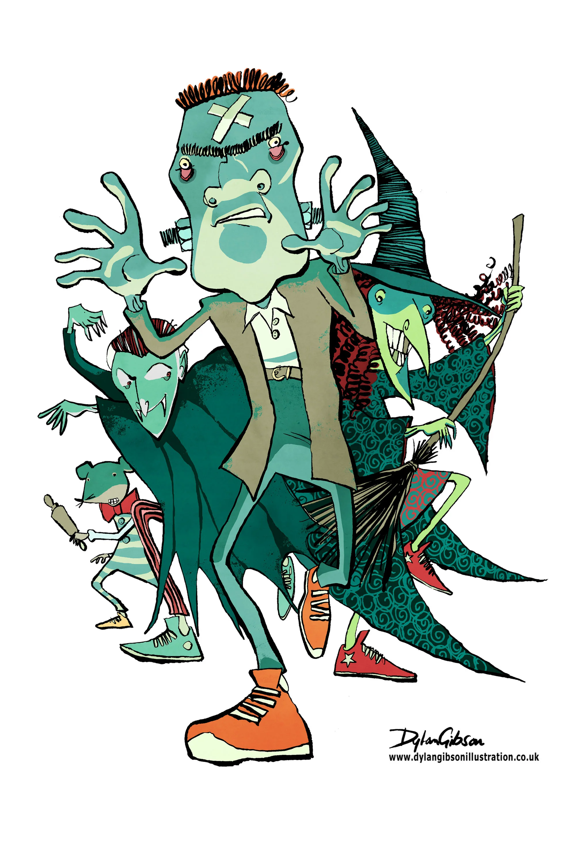
Cover illustration for Halloween Bandits a Lawrence Pinkley Adventure. Illustrated in pen and ink using brushes, art pen, brush pens

Read More

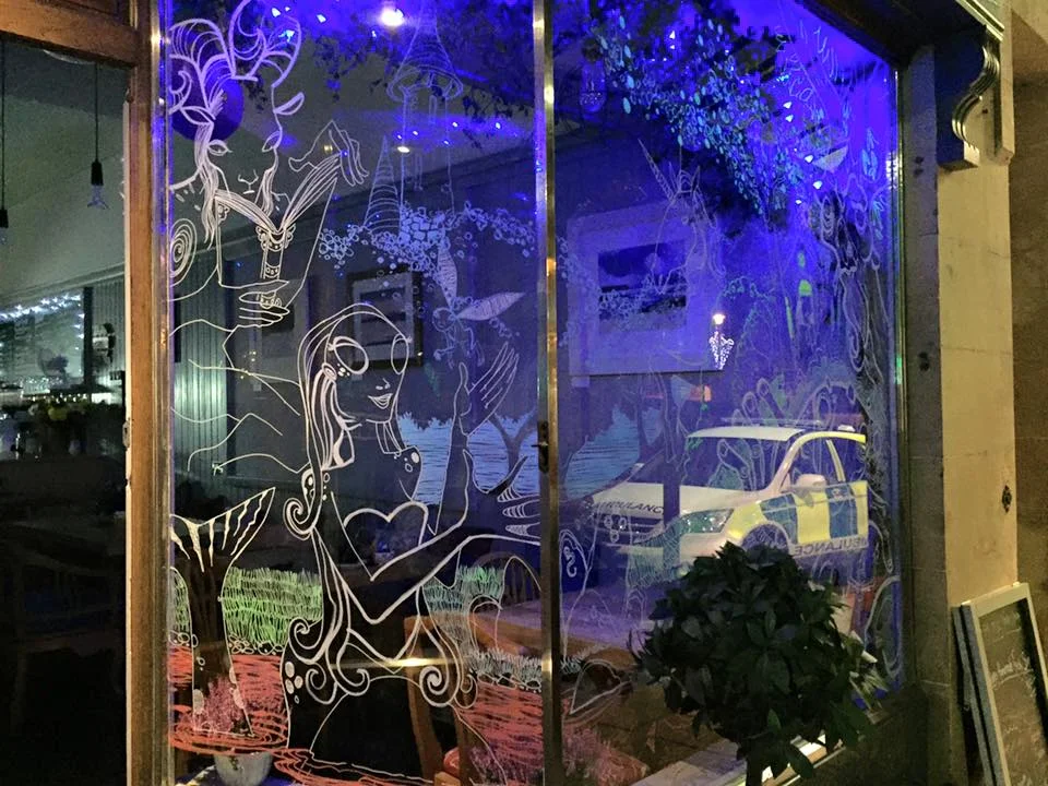
Drawing On Glass

Normally I hit the drawing board when doing an illustration, using paper, whatever weight or type that suits what I’m using to make a mark on it. 

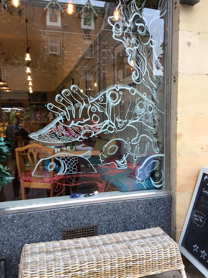
Drawing on a window is a little bit more tricky and to get it right I plan out first what I’m going to draw on it.  Starting like I would in any commission I sketch my ideas down and create a layout on paper so I’ve got a good guide before I illustrate on the window.

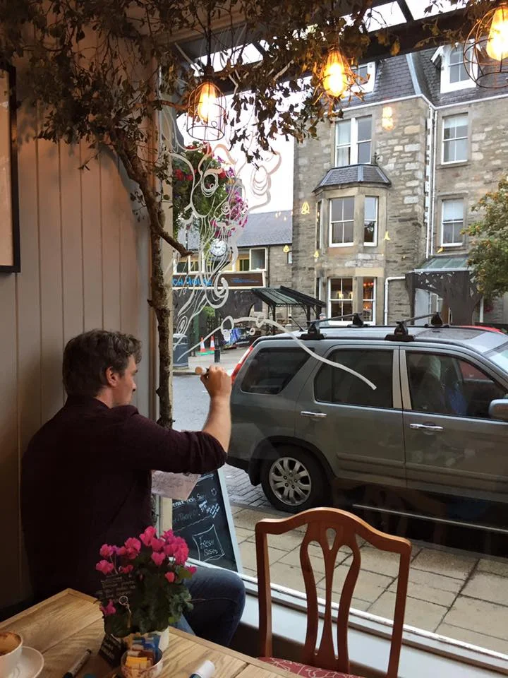
Getting started on Café Calluna’s windows for The Enchanted Forest.

Getting started on Café Calluna’s windows for The Enchanted Forest.

Normally when you stare down a page to begin an artwork all you get is that big white surface filling your view and challenging you to make your first mark.  With a window you struggle with the view ahead, people passing, reluctantly featuring in someone’s selfie with you drawing in it, incidents of road rage and an endless procession of delivery vans. Life passes by and occasionally interacts if you stir a person’s curiosity.  My work for me is normally in a comfort zone and a place where you don’t get that kind of distraction but its so much fun to get out there.  That’s why opportunities to draw in public with window illustrations or chalk art and even live drawing are so great to do.  A chance for real time feedback, sharing my skills and observations. 

Give me some chalk pens and a window to draw on.

Give me some chalk pens and a window to draw on.

Any live drawing event whether it’s in a meeting room fleshing out an idea on paper with a client or in a conference hall recording an event with illustration is a great opportunity for an artist to stimulate and push their skills and share with others.  Making creativity a shared and more interactive experience is a wonderful thing to be part of.  

WIndow at night.

WIndow at night.

A Tricky Scene

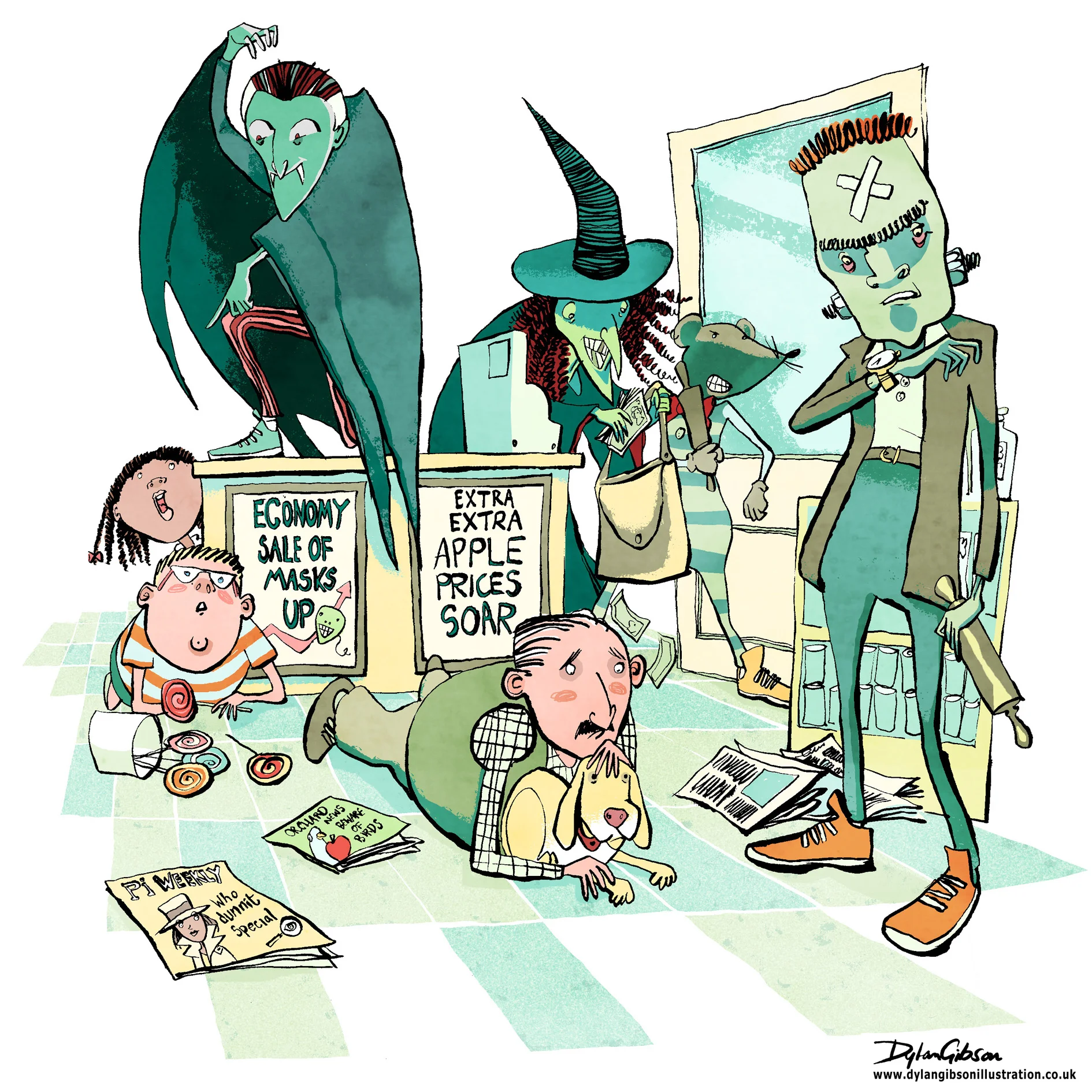
Imagine a robbery at a newsagents and all manner of scary thoughts cross your mind, the potential for someone to get hurt, weapons, dangerous assailants and theft.  When illustrating a scene like that in a children’s book you have to step carefully.   Even when the tone of the book is funny you have to consider making the scene look dangerous and dramatic without having the illustration look too violent or scary.  At the same time you have to give the artwork a little edge as to not belittle how terrifying a robbery can be.  Performing a illustrated balancing act worthy of a trapeze artist starts with laying out the essential elements from the story and composing a layout. 

Creating a good concept illustration is key to developing the right tone and I’ll do that by taking a very rough sketch and using layout paper just go over it again until I get character, composition and tone the way I want it.   Getting it right at this stage means no later disappointment from the publisher by keeping the intention of the approved signed off concept in line with how the finished image will look like.

My Pen and Ink illustration for the Halloween Bandits

My Pen and Ink illustration for the Halloween Bandits


For my robbery scene, illustrated in pen and ink, I added in a few bystanders, a man protecting his dog, and a boy next to a jar of lollipops.  It really helps of course that my robbers were wearing Halloween masks and that alone helps keep the look fun, dramatic and not too scary. 

Halloween Bandits

Cover illustrations can range from the complex, lots of characters and things going on in a active environment to the simple, an object or person.  The focus when illustrating the cover for Halloween Bandits was to capture some of the quirkiness of character in a dynamic action piece.  After creating the character concept illustrations the key to creating a really punchy image that would leap of the cover was to visualize the energy and movement by varying thickness of the line in ink loosely and quick by hand.

All my commissions are hand drawn illustrations I prefer the spontaneity of a hand rendered artwork, quirks and splatters of ink can add a lot of expression to an illustration.   Pen and ink illustrations when got down on paper quickly can look very bold using different techniques and pens and brushes.

The Halloween Bandits Cover illustration.  Hand drawn illustration in pen and ink.

The Halloween Bandits Cover illustration.  Hand drawn illustration in pen and ink.

For more samples including picture book illustrations, narrative and comic illustration or reluctant reader story artwork, please visit my illustration portfolio.

Illustrations are divided into three galleries.

Editorial illustration and advertising artwork.

Picture book illustrations.

Illustrated books which features illustrations for comic and older/reluctant reader illustration samples.


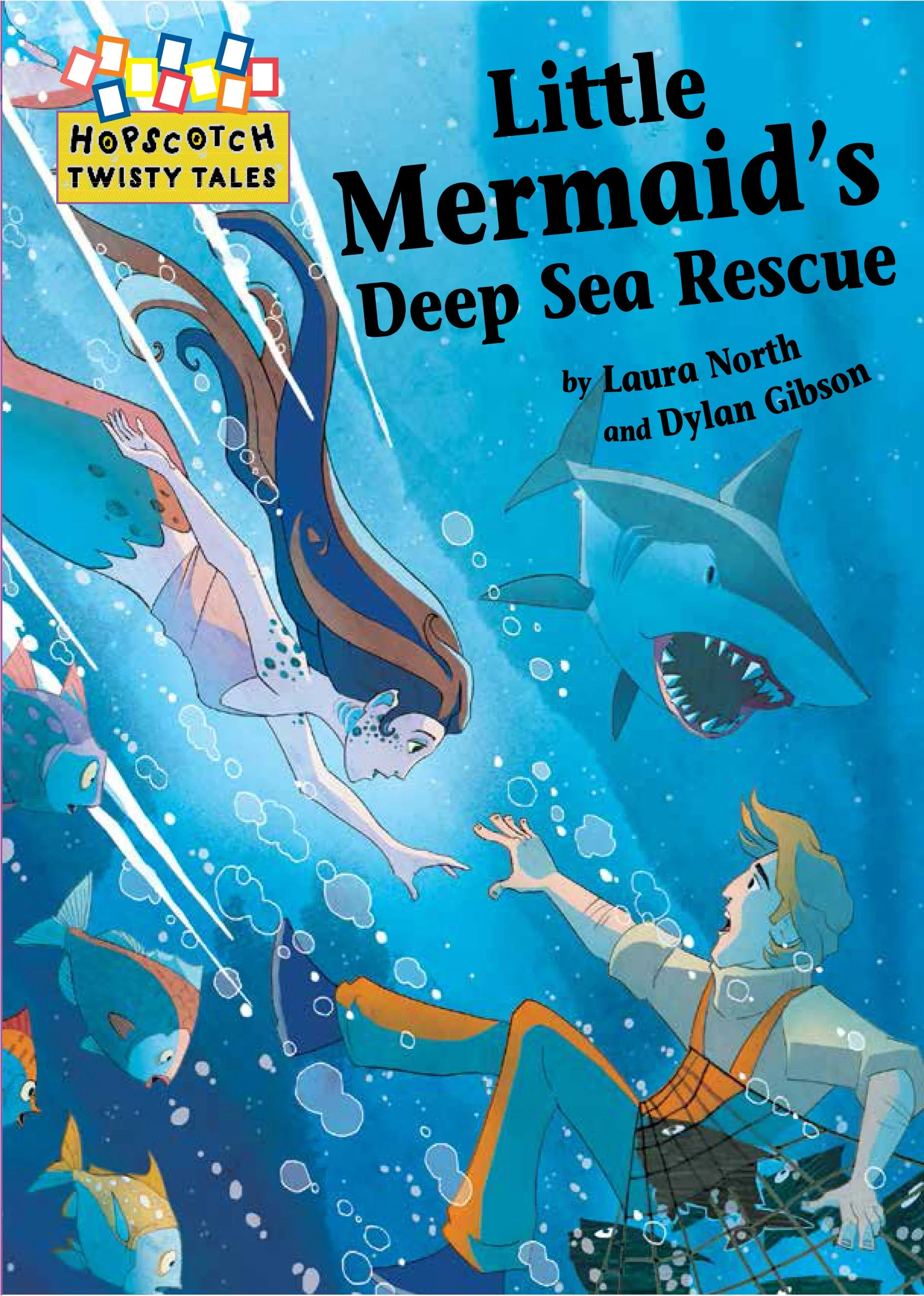
Under the sea, Cover Artwork For the Little Mermaid Adventures

Creating a visually dynamic illustration for a front cover is always the result you want to achieve when starting the project.  For Twisty Tales, The Little Mermaid Adventures commissioned by Franklin Watts the challenge was creating a cover image before the work had started on the book interior illustrations. 

Through the process of roughing out the concepts for the interior you take your characters designs and get to know them better in the actions they take throughout the story.  The character design changes and adapts to the highs and lows of the adventure.  Little tweaks to the look can help express emotions better and it all helps with the narrative.  Doing the character design illustrations first for the book cover is not unusual as long as you know the story and the adventure the characters must face.

I develop my sketches in pencil and hand them over for review, keeping a good line of dialog going with the client and adapting the concept illustrations to fit with the feedback.  Ensuring a quick pace at this stage keeps helps the development and the input fresh so that the character doesn’t get overworked.  

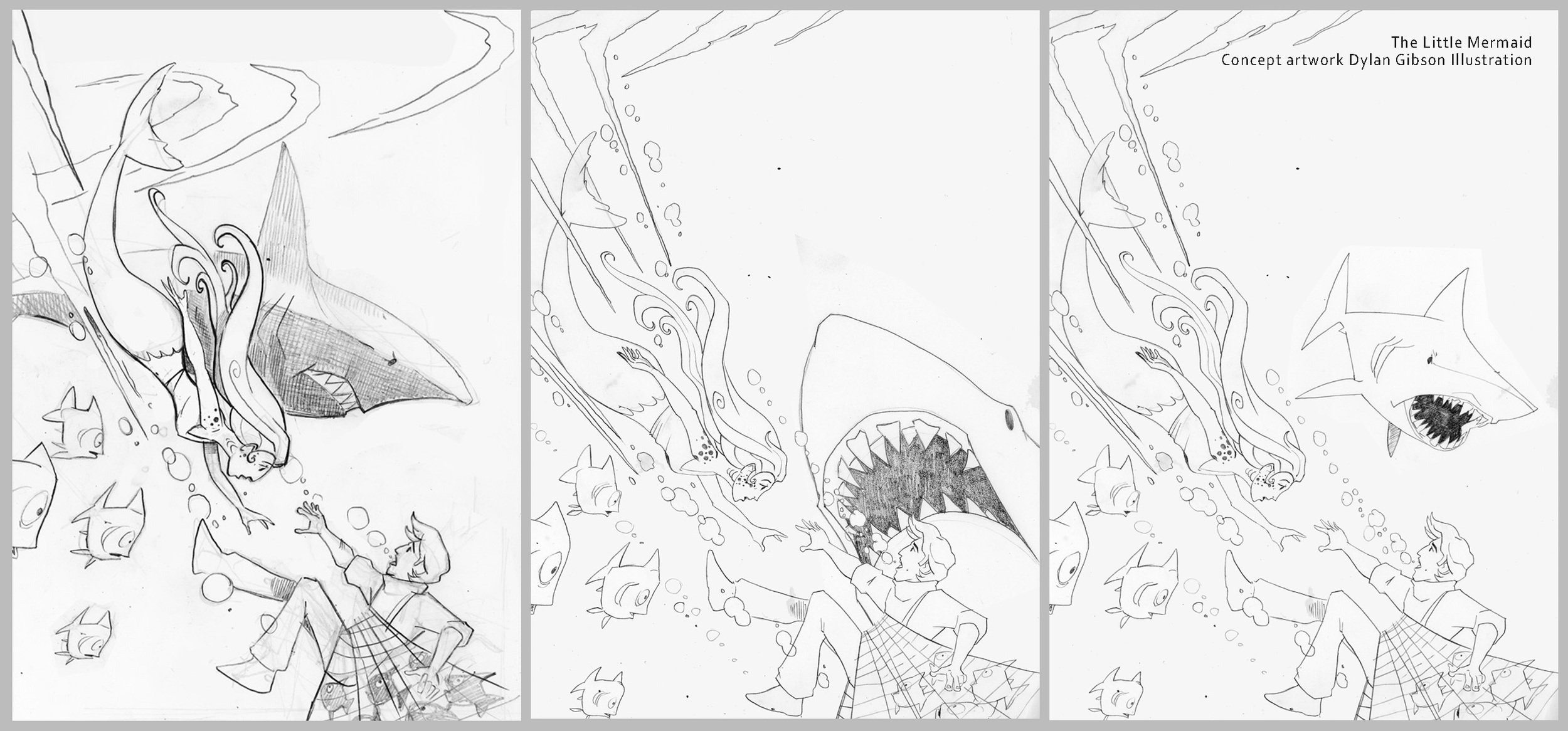
Concept illustrations for the little mermaid.

Concept illustrations for the little mermaid.

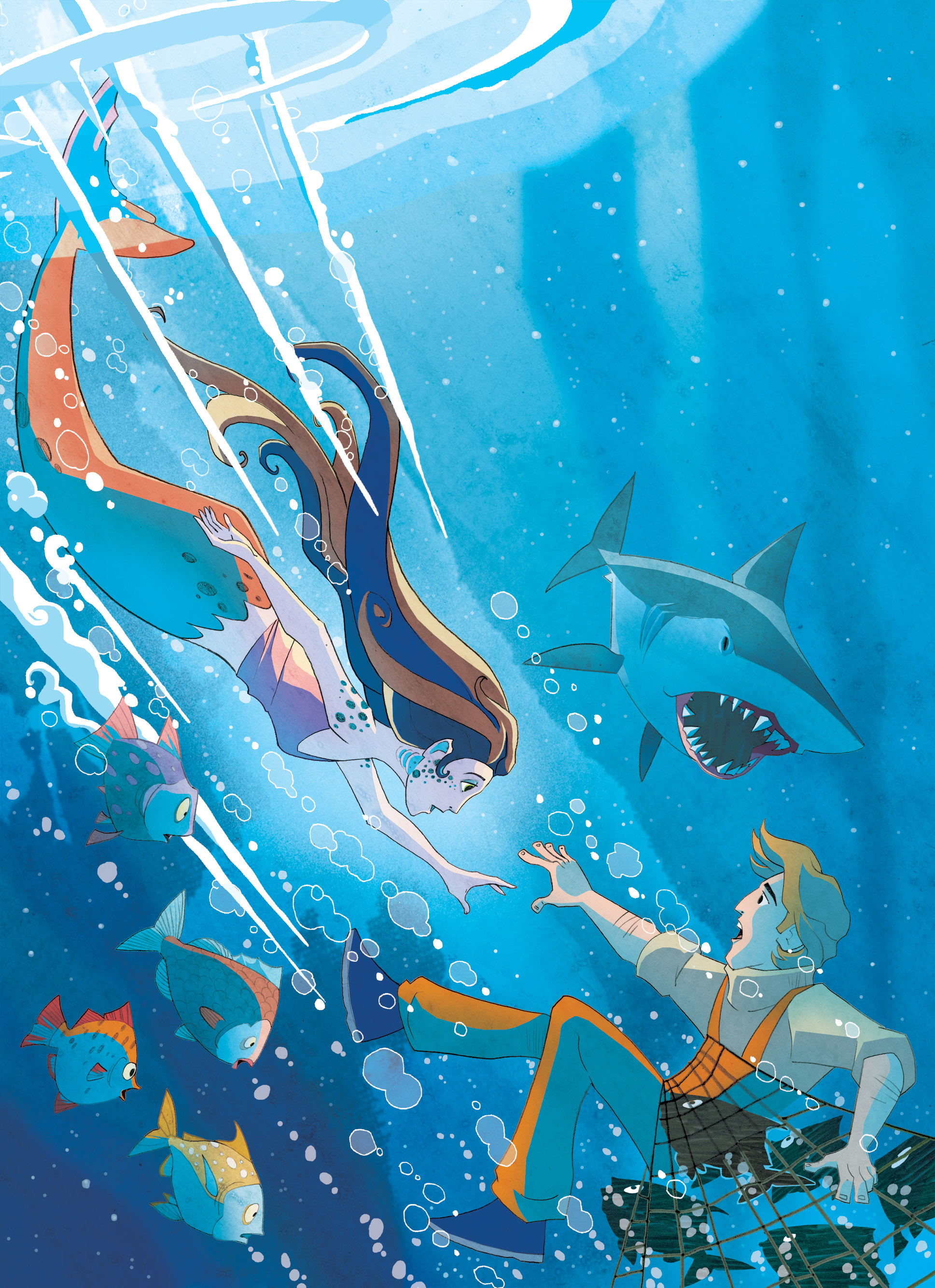
Using the layout provided by the publisher I create the composition for the cover.  The little mermaid shoots through the artwork towards the sailor she is going to rescue.  It’s all very dynamic and has a comic book illustration tone to the layout as its very much a action scene with drama and danger that needs to be conveyed. 

There is no doubt from the layout that the man needs rescuing from drowning but an extra danger from a looming shark also needed to be shown.  Judging how prominent the shark should be was the main item to work out on the layout as the overall composition of the mermaid racing to help the sailor in the bottom corner was very well received.

Book cover illustrations showing the development of the composition.

Book cover illustrations showing the development of the composition.

When it came to finishing the illustration and adding colour I wanted a little bit of the beauty of the underwater world to show, I thought of showing the plankton floating about like stars in a night sky with rays of light from the surface softly lighting the depths below.  With the little room I had left I wanted to show the little mermaids entourage of fish looking concerned at their brethren's plight in the net. 

Finished Book cover illustration

Finished Book cover illustration

Cover Illustration with design.

Cover Illustration with design.

For other Picture Book illustrations, Illustrated stories and narrative illustrations please visit my galleries.  I have also reluctant reader illustrations and comic strip illustrations available to view or request samples of via my contact page.


WOOF!

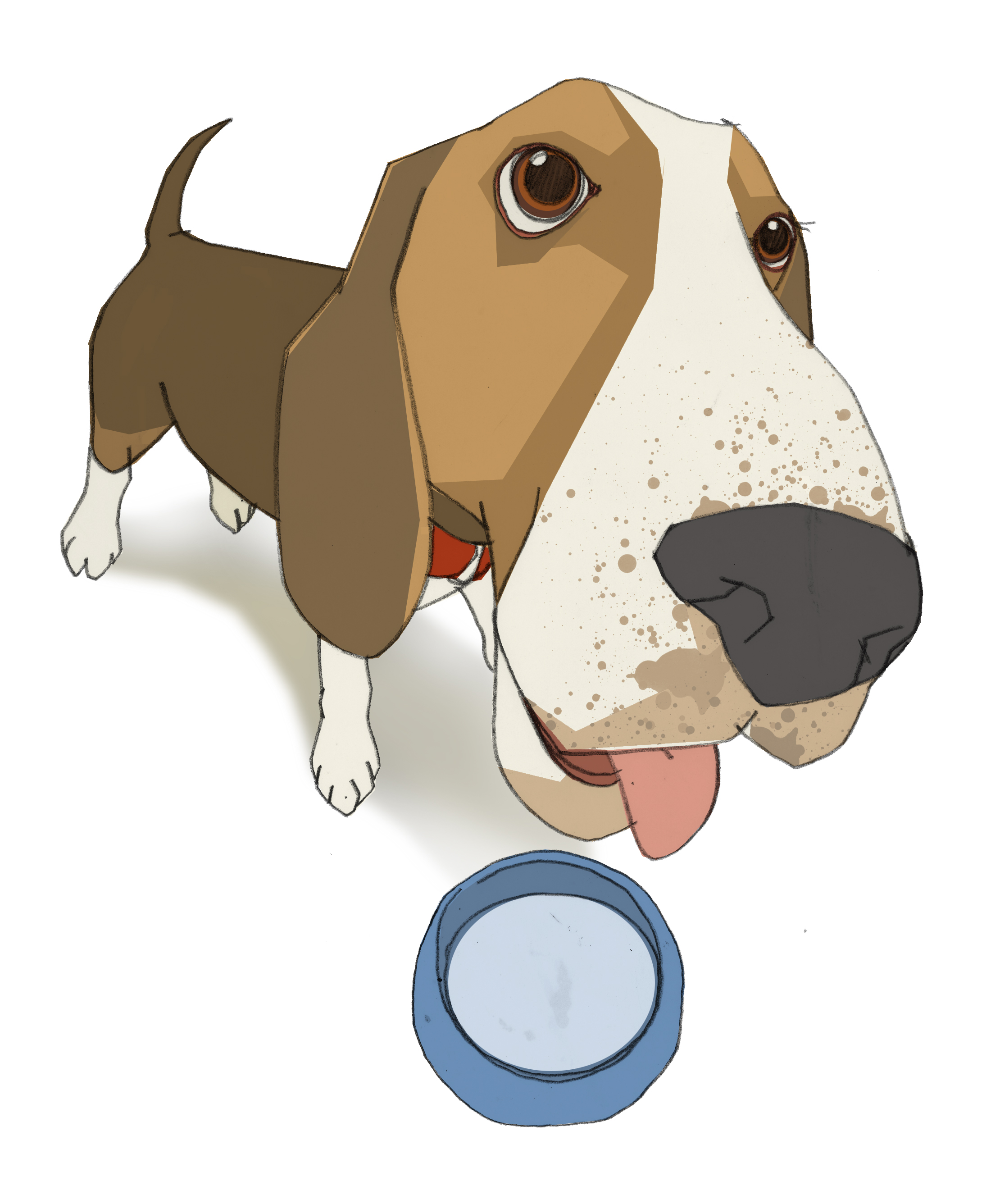
Illustration Friday this week is all about the nose so to sniff around for a little exposure and have some fun I’ve submitted this fellow, my Basset Hound illustration.  Having a little play with perspective to show the head a little closer and focus on the expression gives shows this pooch’s personality more and makes the illustration quirky. 

As a freelance illustrator I’m commission to draw a wide variety of places, people and animals and my work includes advertising illustrations, editorial illustrations, educational illustrations, narrative artwork for children’s books and picture book illustrations.  Having quick visualization skills I’m also asked to illustrate storyboards and commissioned to illustrate character designs and pitch artworks.

Pencil illustration, coloured up and layered on PhotoShop

Pencil illustration, coloured up and layered on PhotoShop

Hopefully I’m not barking up the wrong tree to say that you’ll find my dog illustration as lovable as I do. Waggy tails all round.

To submit an artwork please go to Illustration Friday

Illustrating a Book Pt3 Working on Interior Illustrations

Hand drawn illustrations for the book are created on that old reliable medium of paper.  By using layout paper for the roughs and developing revised drafts over the top you create layers or a history of development of that particular illustration.  When doing the final illustrations in pen and ink I use better quality paper or board, scanning the artwork in then return to using layers in PhotoShop. Again it’s a process of building up the art, beginning with the pen and ink illustration and adding on top or below a new layer that adds to the picture.

Using layers this way gives so much control and the possibility of enhancing the illustration.  The style of the artwork will inform the kind of treatment you give to your layers. Scanning in textures or washes and making the layer setting overlay can give the effect of a hand rendered wash when using software and another layer to colour the illustration.

Normal
0


false
false
false

EN-US
X-NONE
X-NONE


 <w:LatentStyles DefLockedState="false" DefUnhideWhenUsed="true"
DefSemiHidden="true" DefQFormat="false" DefPriority="99"
LatentStyleCount="267">…

The White Arrow Assassin by Tim Flanagan. Left to right: Pen and ink illustration on a layer, Next shows simple shading on a separate normal setting, Last is the texture this is an ink wash on good paper scanned in and set on an overlay layer on top of the shading layer.

Depending on the project this process can involve a few layers to achieve a simple hand rendered look of a line and wash illustration. More complicated illustrations can have many more, the line art can be on several layers and composited together from a foreground to background object or character. Colour added to each layer on a separate layer the line art on a multiplying layer setting so that the colour can be seen below. Textures and lighting added each to different layers to achieve depth, atmosphere and enhance any action in the scene.

It can sound complicated and I hope I did not make it sound like goobledygook! Practice and experience in pushing your skills and solving problems on the way will gives you the skills in confidently creating a layered illustration.

As a freelance illustrator with experience in creating book cover artwork, children’s book and picture book illustrations I create each artwork with the brief, story and finished product in mind.  I’ve built up confidence in using layers to create the illustration, my top tip is to keep a master copy with layers to be able to edit or grab elements or characters to use elsewhere in the book.  The back cover springs to mind as a place wherea ‘drop in’ works well as it always needs a little illustration to sit with the blurb.  Building up the artwork in this way, having the experience in understanding how a book is promoted, the print process and digital release makes you a more valuable resource to the publisher/author. Having their confidence in your skills and professionalism as an illustrator will create further opportunity to collaborate with them again. 

Illustrating a Book pt2 Sketching up the interior

Coming up with the interior illustrations for children’s book is a creative process done in steps, after having got the characters sketched up and approved the next step is creating the scenes that sit alongside the words.

My task as a freelance illustrator is reading the story without pictures with creating the visual narrative in mind.  Reading will naturally fire the imagination and your mind will conjure up images from the descriptions in the story, creatively filling in the picture and the details that lie between the lines.

As I read I will take down notes and sketch I work fast, places and people spill onto a page, drawing concept illustrations, taking bits of layout paper and creating revised drafts on top.  A better idea might come along later and I’ll refine and develop the pencil illustration further till I get something I can show the editor. I’ll finish off my first draft illustrations in pen and ink and email all the interior layouts for feedback.

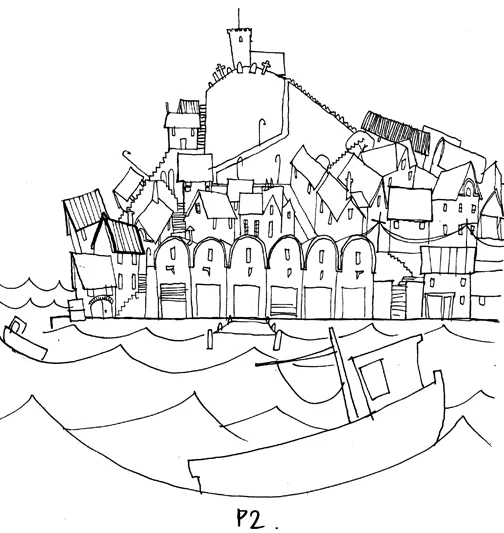
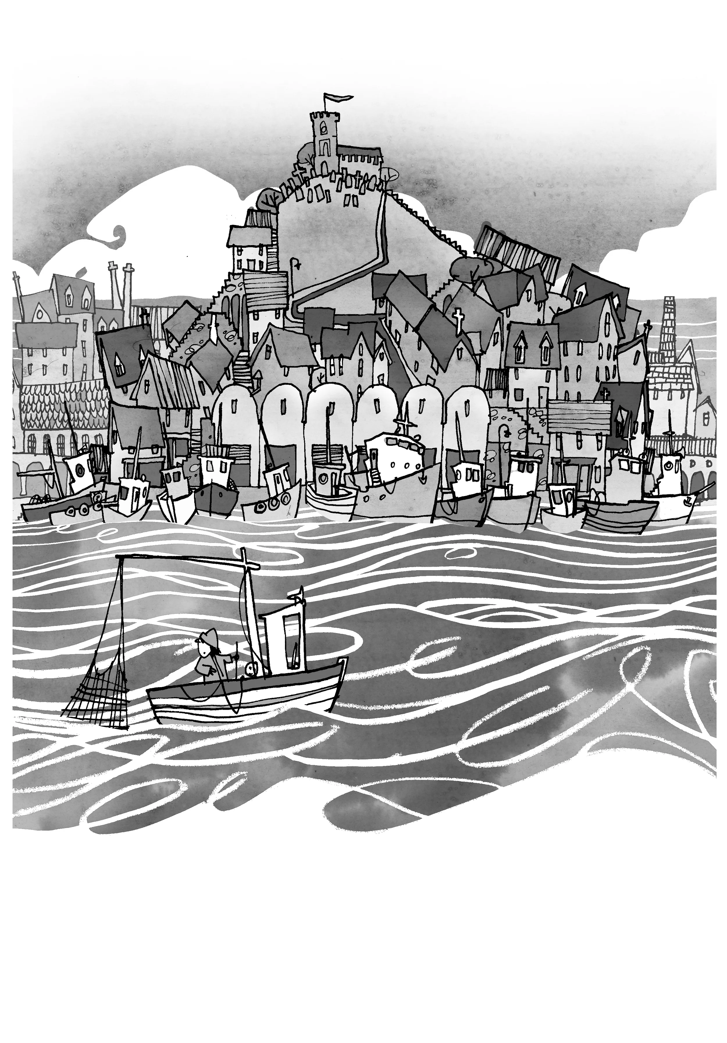
Below I’ve shown my concept illustration for The White Arrow Assassin by Tim Flanagan that establishes the location of where the story is set.

Pen and ink artwork for my Whitby town scene concept.

Pen and ink artwork for my Whitby town scene concept.

Finished artwork for The White Arrow Assassin comparing the final art and concept shows changes and refinement of my original idea.&nbsp; Pen and ink illustration with wash.

Finished artwork for The White Arrow Assassin comparing the final art and concept shows changes and refinement of my original idea.  Pen and ink illustration with wash.

Creating children’s book illustrations has to be done with an open mind and a willingness to change ideas and take on-board suggestions.  Feedback is really helpful and as a freelance illustrator good communication with the author/editor really helps.  Receiving feedback isn’t always easy but it is essential if you want to get the most from the creative process, it brings out the best in my skills as an artist in order to create the best illustrations possible for the book.


Illustrating a Book pt1 Character Design.

I doodle when I’m talking to an editor or author about their thoughts for the book I’m about to work on.  Don’t worry I multi task, doodling is my form of note taking and I’ll sketch down ideas whilst I chat to get a feel for the world that’s about to be created.

When I get down to starting the project, reading and understanding what the story is about is key to doing the illustrations.   Taking note of the important details is the first step in creating the illustrations.  Understanding the inferences made allows me to expand on the precise words laid down in the story and gives me a range of other things I can illustrate into the scenes and characters to create a place.  Going through this detailed first read helps me create narrative illustrations that will draw the reader’s focus.

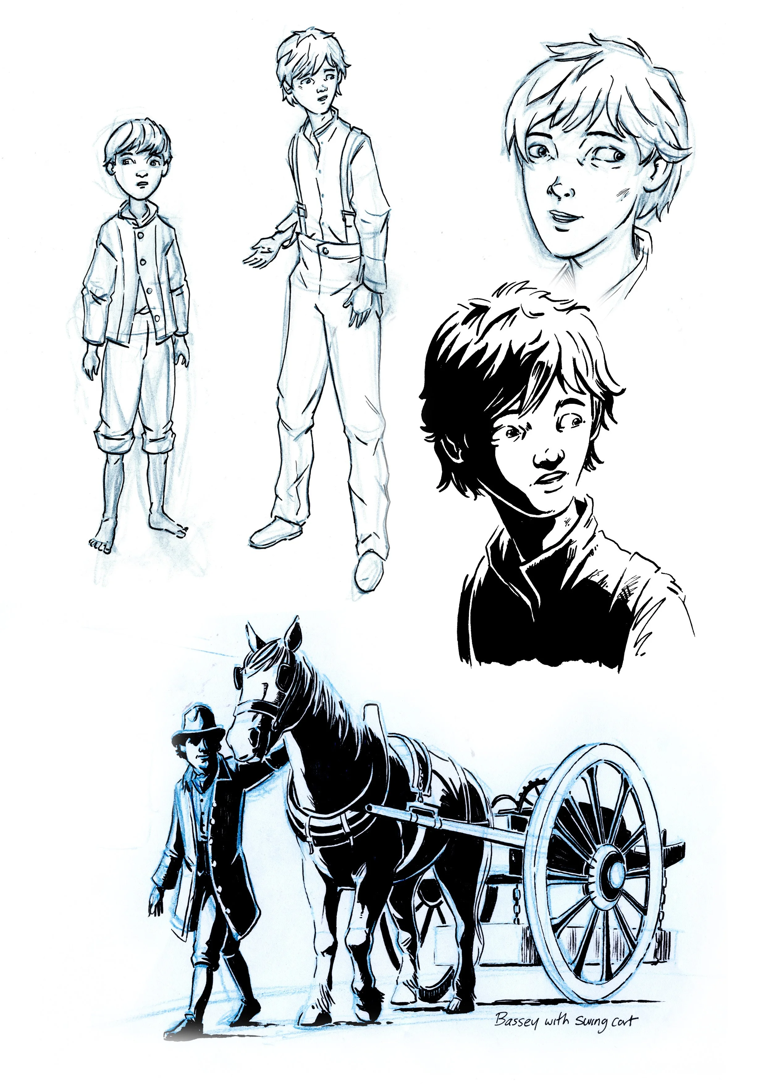
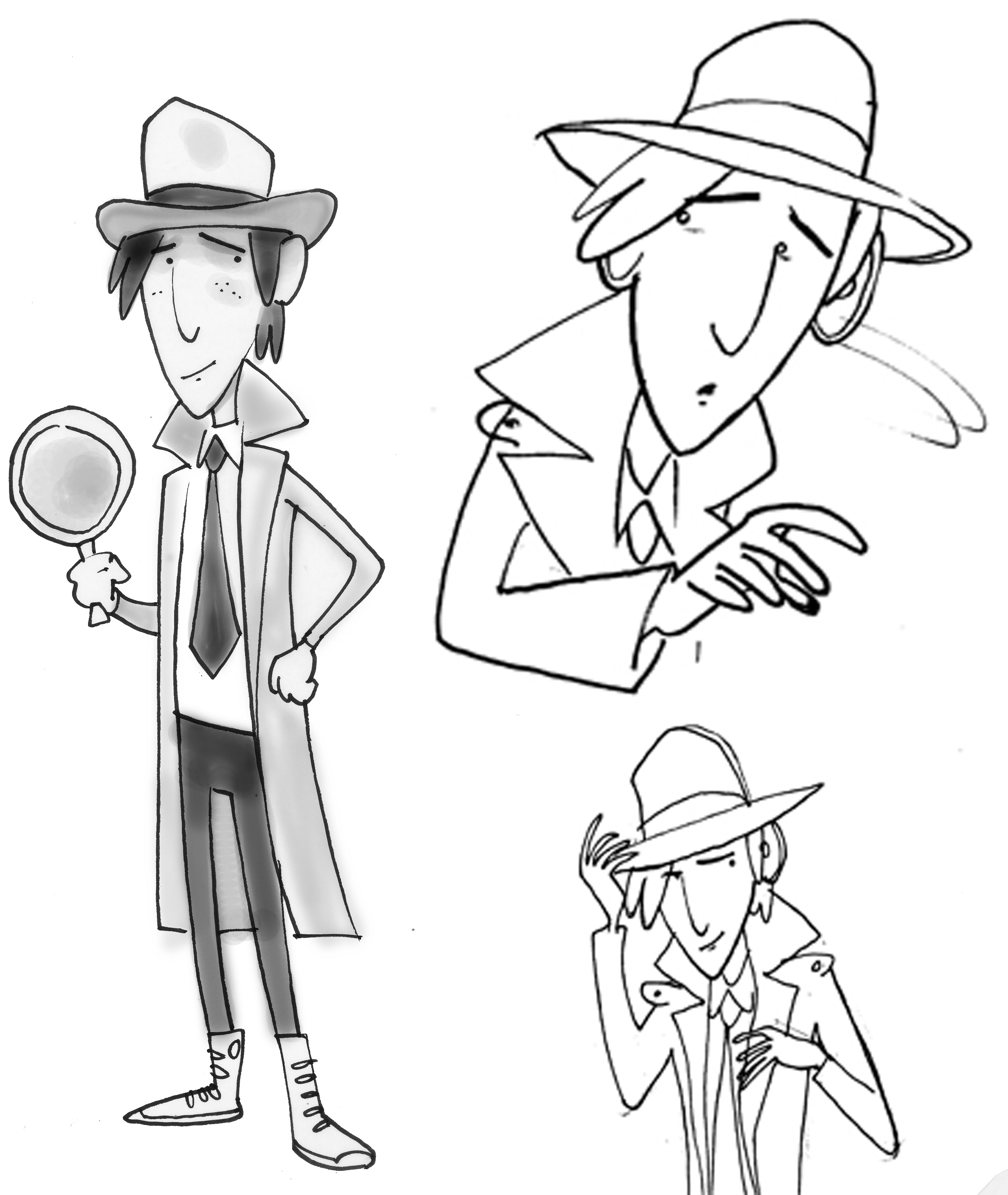
I’ll come up with the character design illustrations first, either little pencil sketches that I develop sometimes over several drafts, or quick designs I can capture straight away. At this stage the visual tone of the book is being developed via the character illustrations.  My conceptual artworks are emailed to the editor/author for feedback and comments.

Pen and ink illustrations for Lawrence Pinkley character development.

Pen and ink illustrations for Lawrence Pinkley character development.

The main protagonist is usually the entry point for the reader, a character the audience can immediately identify with and start to get to know.  While you want the audience to identify strongly with this character the illustration doesn’t have to be of a ‘conventional hero’  even if the book is about a multi legged monster there has to be something that humanizes the design in some way that lets you feel for them.

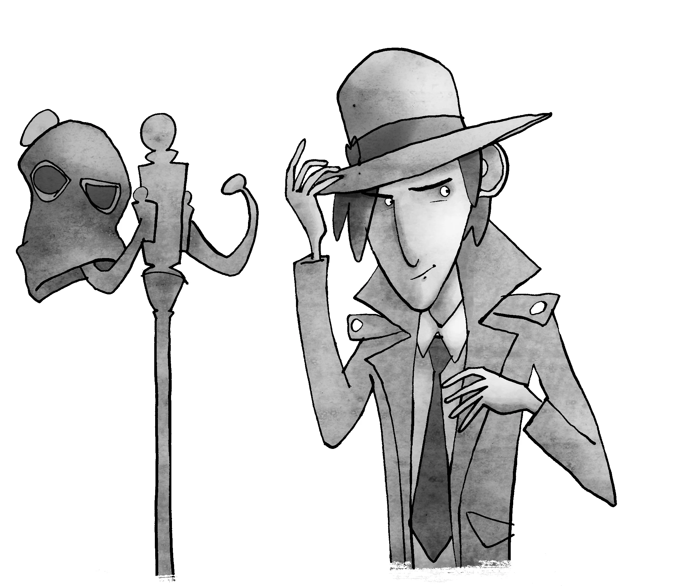
In The White Arrow Assassin by Tim Flanagan, Lawrence Pinkley a detective is the main guy in the story, he’s a lanky, slightly awkward looking teenage, who has not fully grown into his skin yet.  He often jumps to the wrong conclusions but is noble and wants to follow on from his father’s footsteps.  He’s the straight man unaware of the silly goings on around him. 

Creating the other characters such as Reverend Tansey, The White Arrow Assassins and others that inhabit Pinkley’s world.&nbsp; More flamboyant and quirkier looking character types capturing the tone and highlighting the humor in the story.&nbsp;&nb…

Creating the other characters such as Reverend Tansey, The White Arrow Assassins and others that inhabit Pinkley’s world.  More flamboyant and quirkier looking character types capturing the tone and highlighting the humor in the story.  


A finished version of Lawrence Pinkley from the book The White Arrow Assassin by Tim Flanagan.&nbsp; Pen and ink illustration using dip pens and felts, painted on Photoshop.

A finished version of Lawrence Pinkley from the book The White Arrow Assassin by Tim Flanagan.  Pen and ink illustration using dip pens and felts, painted on Photoshop.

ILLUSTRATING NARRATIVE

The fun of Illustrating a book is sitting down with the story and imagining what the characters and the setting will look like.  Sometimes the outline is descriptive but still open to interpretation, other times I've got free reign to come up with ideas and solutions.  My task is to visualize your text and enrich the experience for the reader by first sending you the character design illustrations for feedback and then getting to work on the interior draft.

Below is the opening chapter and my illustration, hand rendered in pen and ink to accompany it.

Allow me to introduce myself -my name is Lawrence Pinkley, I'm a private detective. There aren’t
many eighteen year old detectives in Whitby, in fact, I'm the only one, but not by choice. I found myself pulled to the cold north east of England following the death of my father, when I unwillingly inherited the Pinkley Investigation Group, or PIG for short.

The White Arrow Assasin Pen and ink illustration