
This nice little 4 page comic was commissioned by Magic Torch Comics. The story I illustrated, Calasraid was part of an anthology of tales. Colourful art, action with a bit of silliness masks a darker story that has brutal ending. Read this story and many more for free at Magic Torch Comics

Creating Graphic Novel Artwork
Telling a captivating story with pictures is a love of mine and I’m always thrilled when I get a commission to create illustrations for a new visual narrative. The draft and finished page below has been taken from Goliath a story set in 1967 and the year 2000.
As much as I hate to admit it the year 2000 is now firmly in the past and this novel is essentially two period pieces within one story! So the look of both times needs researched and delving into the past to get the look and feel right can be it’s own time consuming rabbit hole if you let it. You get an immediate satisfaction if you get it right. I think the trick is not to pick out too many obvious examples from the period as this especially in the case of fashions can make the feel characteristic.
First I start by reading the story, I let it percolate a bit in my mind and play it out in my imagination like a film, thinking composition, point of view and pacing. I try to trust my intuition and find that if it feels easy to draft down on the page then I’m doing it right. After I might go back into it and do a little refinement before illustrating the final page.
I still draft my rough pages by hand and you can see I have a love for using colour pencils. This draft stays very close to the final page, you will see a little refinement here and there only. The finished art is hand drawn in pen & ink then scanned. I use a layer with textured paper to help soften the shade I add to give it a wash, water coloured feel which I think helps adds to the period look.
I used greyscale with some colour to highlight elements for the 1967 time period and used colour for the year 2000 parts of the story so the reader knows when exactly they are at a glance.
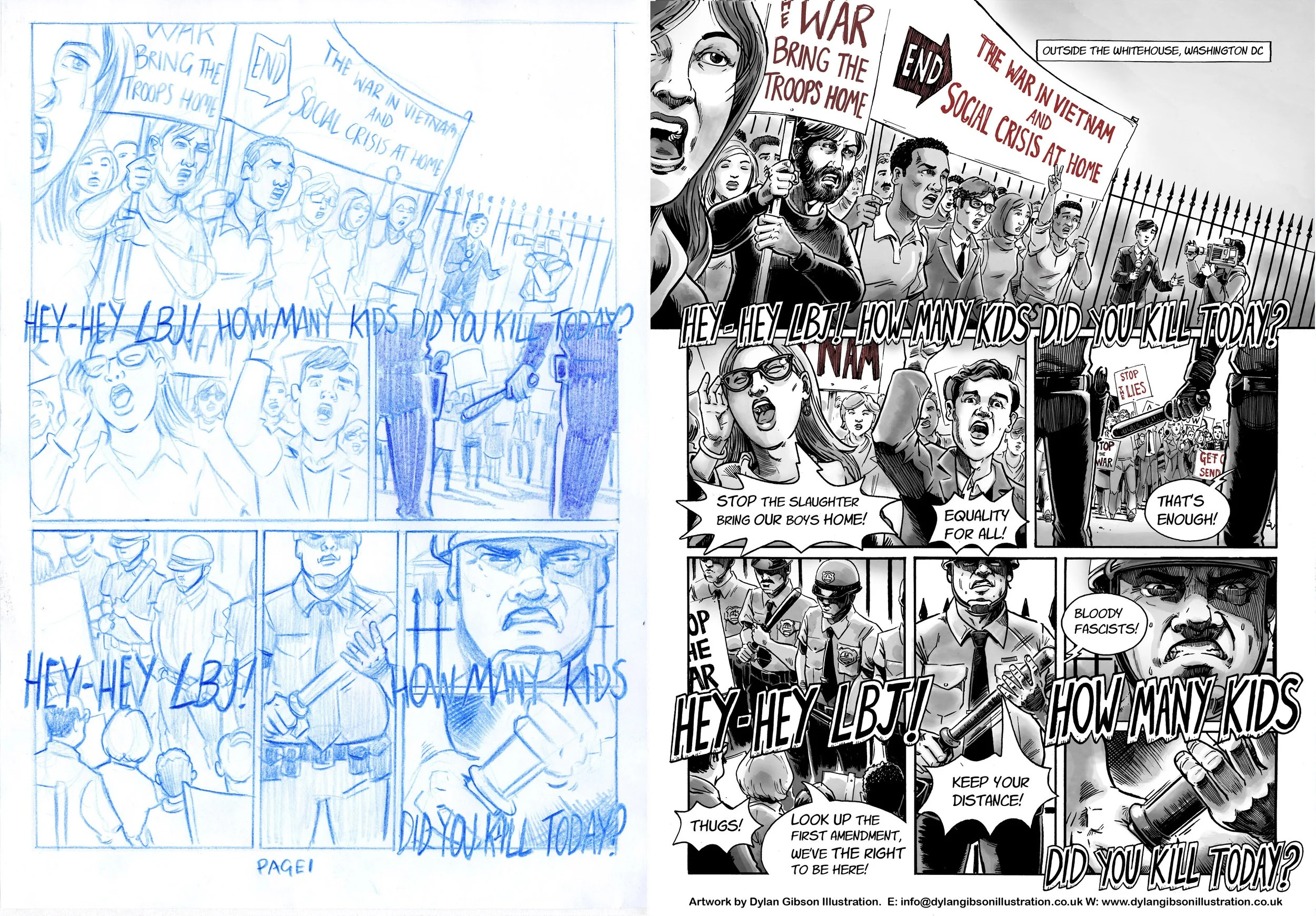
Goliath. Draft page and Finished art comparison. All my illustrations are hand rendered in pen and ink.
Illustrating a Book Pt4 Working on the cover
Illustrating the cover shouldn’t be any different from drawing the artwork for the interior but is in many ways. Firstly it’s an important factor in selling the book and has to represent what the story is about inone image, it has to illustrate the tone of the book whether its humorous, dramatic or an adventure story. It needs to convey the genre maybe in an overt way or more subtlety, an example is a fantasy story with magic, monsters and strange lands that needs to be communicated on the cover to the potential reader.
Ways of illustrating this could be to show full on these fantasy elements with more recognisable details becoming secondary. Another approach would be to ground the story showing the more approachable characters more prominently and the fantasy as a backdrop. As an artist there is maybe no right or wrong direction and it is more about responding to the story as a reader and interpreting it as a creative in the way you believe most fits the story. As a freelance illustrator commissioned by an editor or author to create an artwork for the cover it’s a different matter as you will receive a brief or outline for you to interpret. The scope of what you can create will vary from project to project. A tight brief is not a constraint to your imagination rather an opportunity, a creative response can be just as effective while working within set boundaries.
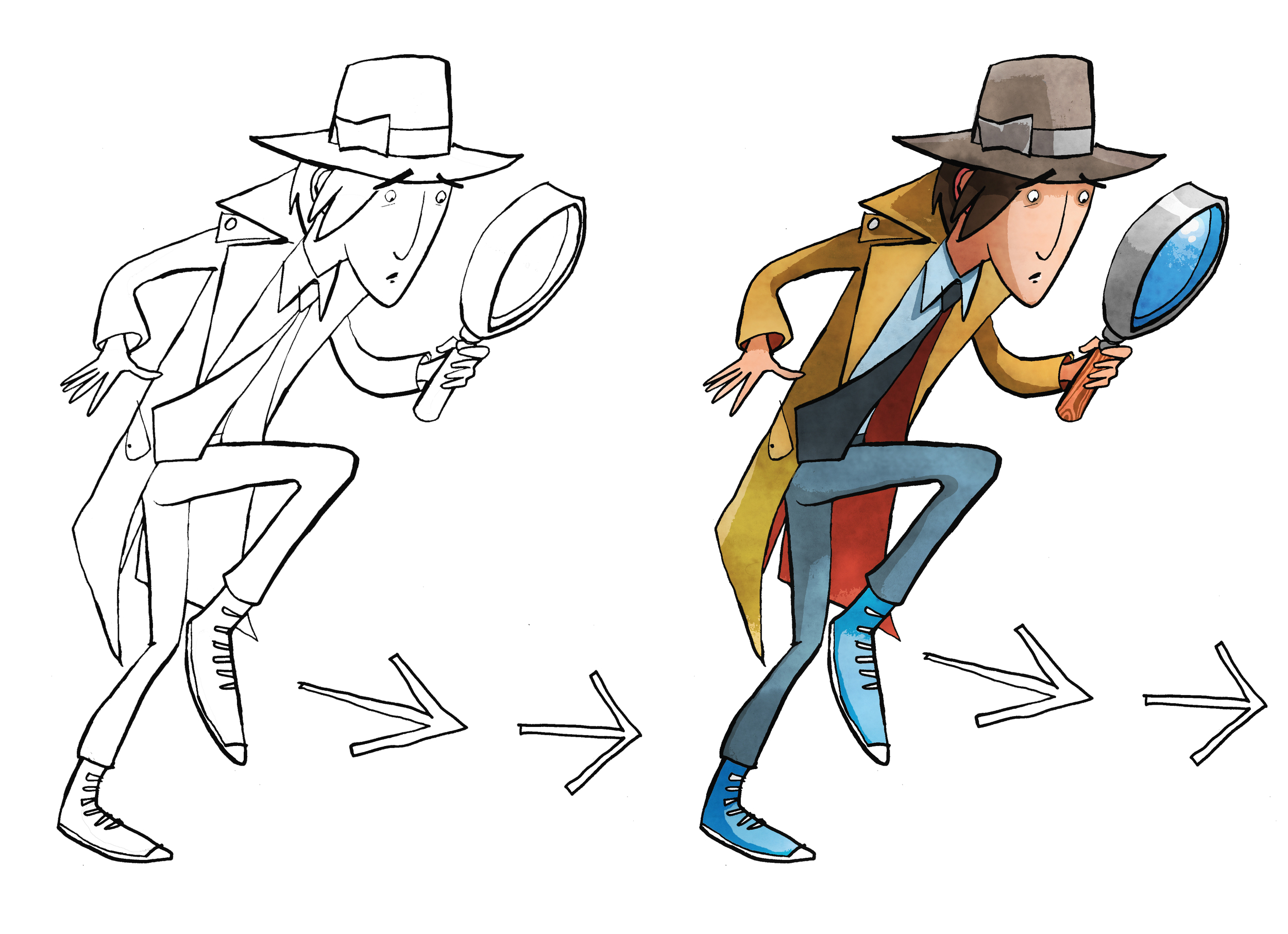
Cover Illustration rough and finished artwork for dropping into design. Pen and ink using art pens, dip pen and brush. Illustration coloured on PhotoShop.
The book cover illustration for The White Arrow Assassin by Tim Flanagan was a rather simple brief to show the main character Private Investigator Lawrence Pinkley. The character illustration was to be set on a coloured background with title and not include location or any scene from the book. Visually there are a few ways that you can sell what he does on the front cover in a quick and effective way. If you were to do word association with the description of detective a number of stereotypical answers about look and props would come your direction. Using iconic imagery was key to sell the idea to audiences quickly. As Pinkley’s look is typical of old gum shoe and noir detectives and his age is set down in the story, the boundaries are there to work within and the key challenge is representing by understanding his character in a quirky way. He’s still new to the profession and out of his depth the humour in the story comes from his not understanding and inferring incorrectly from clues, resulting in the wrong deduction. So when creating his character, a little bit of awkwardness in his physicality and stance goes some way in conveying this in the illustration.