Superhero style character design for Sustainables Academy by Dylan Gibson.
Read MoreHigh Seas Adventure
Illustrating a children's story is a joy and a learning experience for me, the process of developing the visuals from character, concept layout to finished artwork creates opportunities to develop my existing techniques or learn new ones. This process I hope ultimately rewards the reader and fully realises the author, publishers and my own vision.
I think its very important not to get to caught up in my own style and allow flexibility in my approach as openness and the wiliness to try new ideas can also refresh what you can do as an artist.
Below is a little example, this illustration was created to primary focus on the characters on board the pirate ship, giving space to each personality. The children's book artwork was rendered in pencil, I played around with layers adding paper textures to give a watercolour style texture to the colour.
Please get in touch if you have any questions or would like to be sent samples.
A Tricky Scene
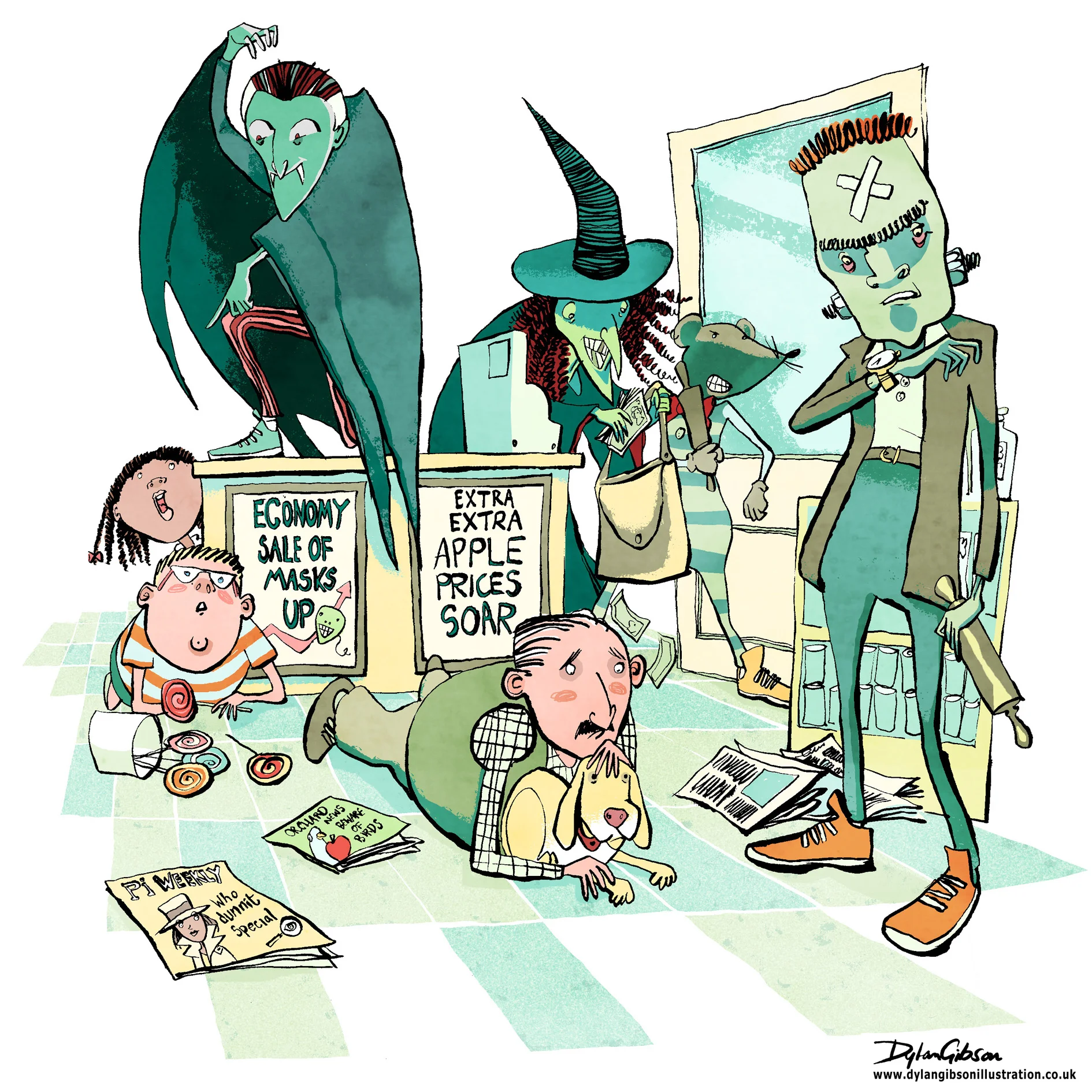
Imagine a robbery at a newsagents and all manner of scary thoughts cross your mind, the potential for someone to get hurt, weapons, dangerous assailants and theft. When illustrating a scene like that in a children’s book you have to step carefully. Even when the tone of the book is funny you have to consider making the scene look dangerous and dramatic without having the illustration look too violent or scary. At the same time you have to give the artwork a little edge as to not belittle how terrifying a robbery can be. Performing a illustrated balancing act worthy of a trapeze artist starts with laying out the essential elements from the story and composing a layout.
Creating a good concept illustration is key to developing the right tone and I’ll do that by taking a very rough sketch and using layout paper just go over it again until I get character, composition and tone the way I want it. Getting it right at this stage means no later disappointment from the publisher by keeping the intention of the approved signed off concept in line with how the finished image will look like.
My Pen and Ink illustration for the Halloween Bandits
For my robbery scene, illustrated in pen and ink, I added in a few bystanders, a man protecting his dog, and a boy next to a jar of lollipops. It really helps of course that my robbers were wearing Halloween masks and that alone helps keep the look fun, dramatic and not too scary.
Under the sea, Cover Artwork For the Little Mermaid Adventures
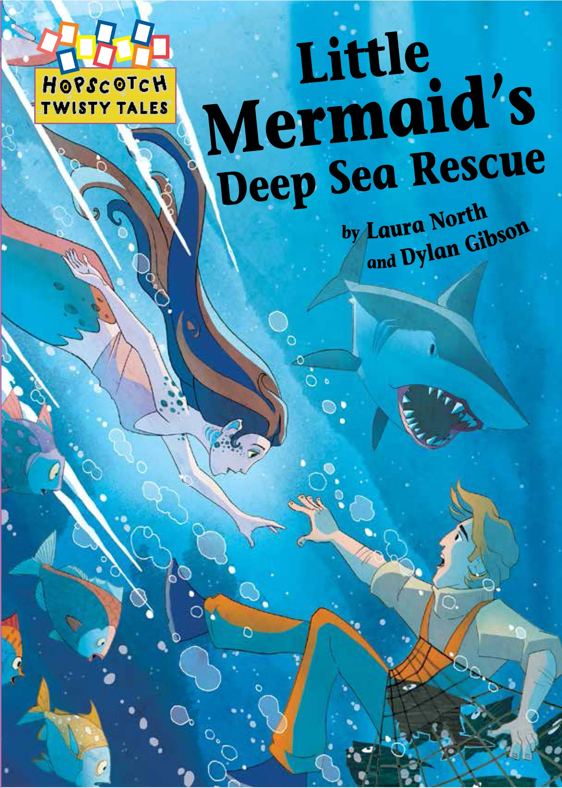
Creating a visually dynamic illustration for a front cover is always the result you want to achieve when starting the project. For Twisty Tales, The Little Mermaid Adventures commissioned by Franklin Watts the challenge was creating a cover image before the work had started on the book interior illustrations.
Through the process of roughing out the concepts for the interior you take your characters designs and get to know them better in the actions they take throughout the story. The character design changes and adapts to the highs and lows of the adventure. Little tweaks to the look can help express emotions better and it all helps with the narrative. Doing the character design illustrations first for the book cover is not unusual as long as you know the story and the adventure the characters must face.
I develop my sketches in pencil and hand them over for review, keeping a good line of dialog going with the client and adapting the concept illustrations to fit with the feedback. Ensuring a quick pace at this stage keeps helps the development and the input fresh so that the character doesn’t get overworked.
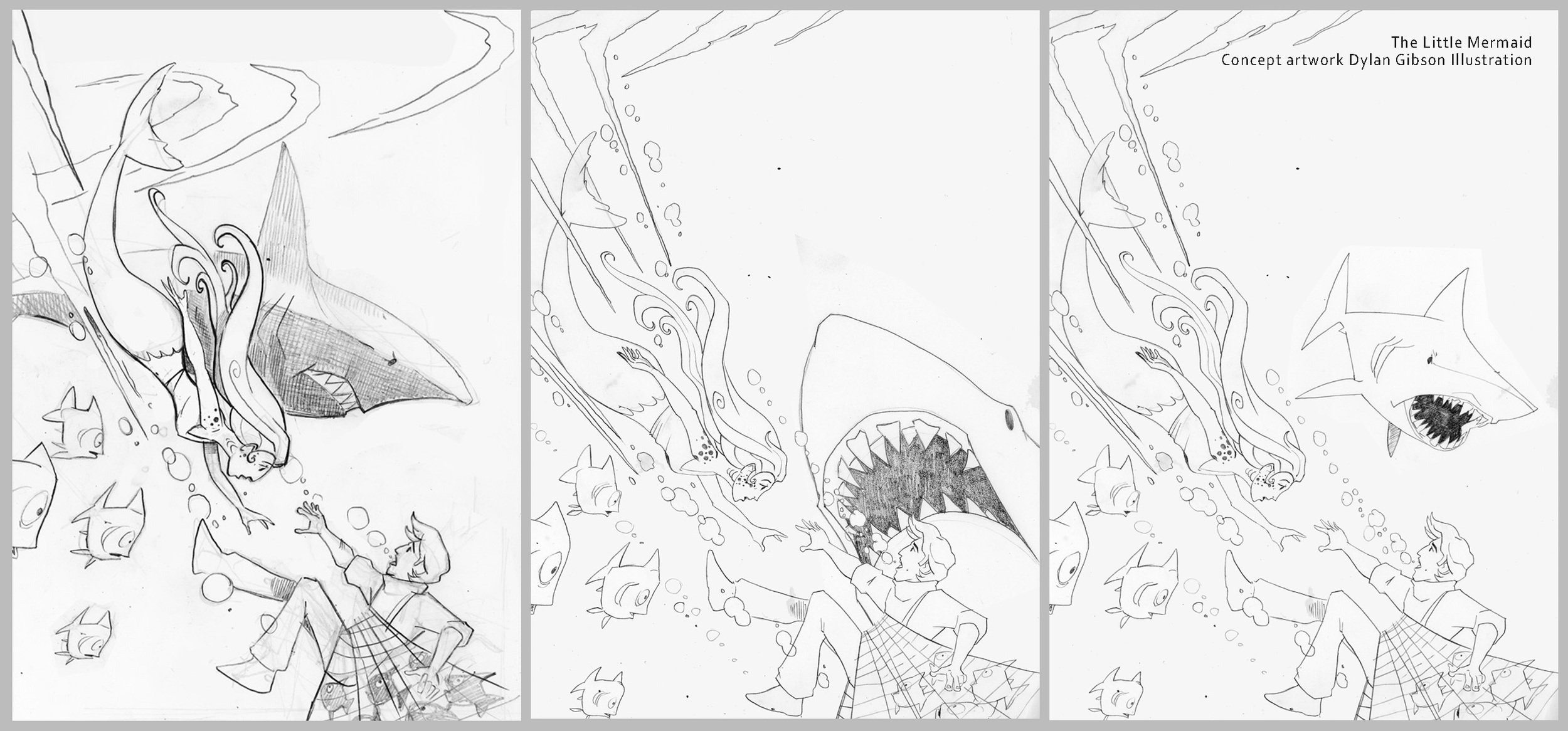
Concept illustrations for the little mermaid.
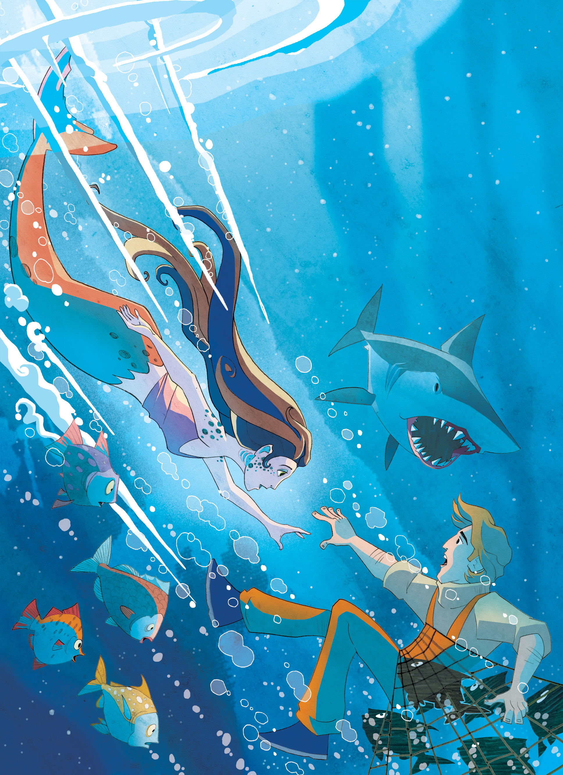
Using the layout provided by the publisher I create the composition for the cover. The little mermaid shoots through the artwork towards the sailor she is going to rescue. It’s all very dynamic and has a comic book illustration tone to the layout as its very much a action scene with drama and danger that needs to be conveyed.
There is no doubt from the layout that the man needs rescuing from drowning but an extra danger from a looming shark also needed to be shown. Judging how prominent the shark should be was the main item to work out on the layout as the overall composition of the mermaid racing to help the sailor in the bottom corner was very well received.
Book cover illustrations showing the development of the composition.
When it came to finishing the illustration and adding colour I wanted a little bit of the beauty of the underwater world to show, I thought of showing the plankton floating about like stars in a night sky with rays of light from the surface softly lighting the depths below. With the little room I had left I wanted to show the little mermaids entourage of fish looking concerned at their brethren's plight in the net.
Finished Book cover illustration
Cover Illustration with design.
For other Picture Book illustrations, Illustrated stories and narrative illustrations please visit my galleries. I have also reluctant reader illustrations and comic strip illustrations available to view or request samples of via my contact page.

