Whats on the box

When we read our imagination takes us further, it will fill in and create extra depth and meaning to the story we're reading.  An illustrators job is to visualise those imagining and deduce what might be going on in a scene or character interaction that isn't described in the authors words.

When creating illustrations for a story, I very much focus on the process of developing what my imagination is telling me to the page.   I'm always keen to make suggestions and develop ideas that can help enrich what the author has written. 

This scene was created to show how the children in the story bond with the robot, originally it was supposed to be a dinner table scene, though as robots don't eat it highlighted the difference of him as a character and separated him from the kids in the story.  Instead I fleshed out this scene with them all watching something scary, so that a bond is created by their share experience.  

This artwork was created by hand using pencils, scanned and layered and painted on Photoshop 

This artwork was created by hand using pencils, scanned and layered and painted on Photoshop 


Illustration Friday

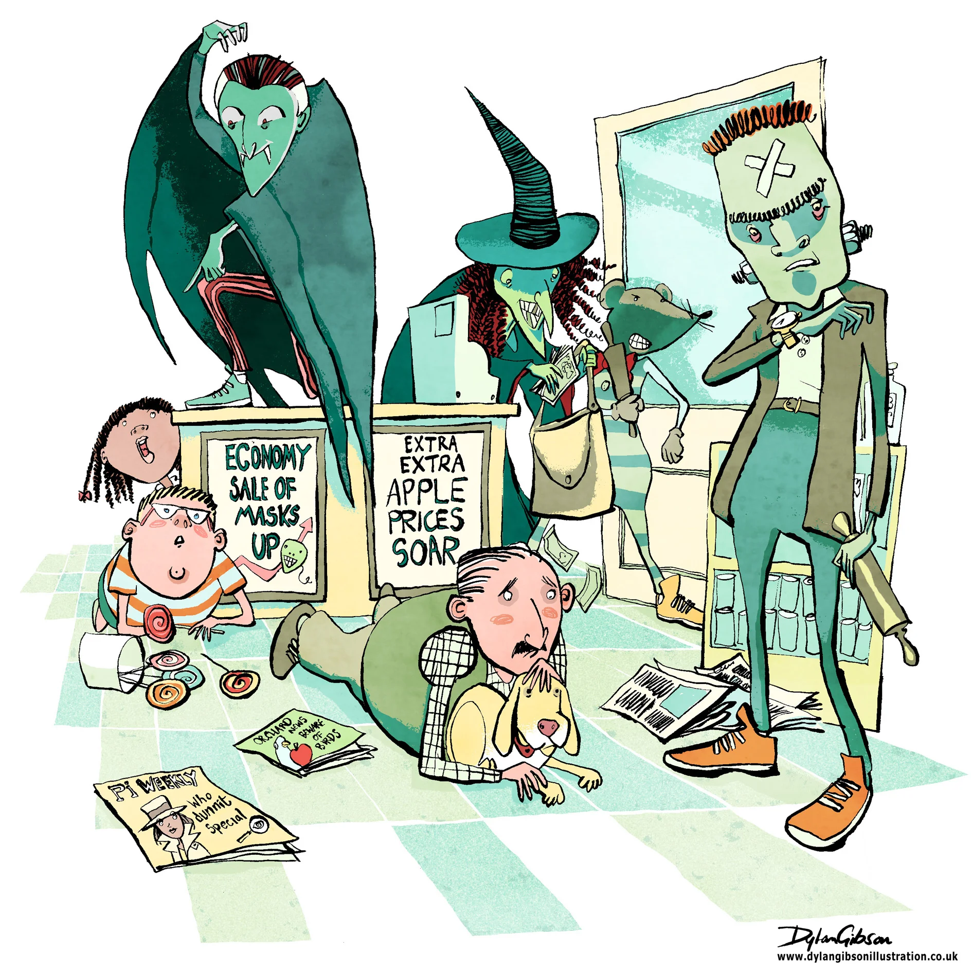
Cover illustration for Halloween Bandits a Lawrence Pinkley Adventure. Illustrated in pen and ink using brushes, art pen, brush pens

Read More

A Tricky Scene

Imagine a robbery at a newsagents and all manner of scary thoughts cross your mind, the potential for someone to get hurt, weapons, dangerous assailants and theft.  When illustrating a scene like that in a children’s book you have to step carefully.   Even when the tone of the book is funny you have to consider making the scene look dangerous and dramatic without having the illustration look too violent or scary.  At the same time you have to give the artwork a little edge as to not belittle how terrifying a robbery can be.  Performing a illustrated balancing act worthy of a trapeze artist starts with laying out the essential elements from the story and composing a layout. 

Creating a good concept illustration is key to developing the right tone and I’ll do that by taking a very rough sketch and using layout paper just go over it again until I get character, composition and tone the way I want it.   Getting it right at this stage means no later disappointment from the publisher by keeping the intention of the approved signed off concept in line with how the finished image will look like.

My Pen and Ink illustration for the Halloween Bandits

My Pen and Ink illustration for the Halloween Bandits


For my robbery scene, illustrated in pen and ink, I added in a few bystanders, a man protecting his dog, and a boy next to a jar of lollipops.  It really helps of course that my robbers were wearing Halloween masks and that alone helps keep the look fun, dramatic and not too scary. 

Illustrating a Book Pt3 Working on Interior Illustrations

Hand drawn illustrations for the book are created on that old reliable medium of paper.  By using layout paper for the roughs and developing revised drafts over the top you create layers or a history of development of that particular illustration.  When doing the final illustrations in pen and ink I use better quality paper or board, scanning the artwork in then return to using layers in PhotoShop. Again it’s a process of building up the art, beginning with the pen and ink illustration and adding on top or below a new layer that adds to the picture.

Using layers this way gives so much control and the possibility of enhancing the illustration.  The style of the artwork will inform the kind of treatment you give to your layers. Scanning in textures or washes and making the layer setting overlay can give the effect of a hand rendered wash when using software and another layer to colour the illustration.

Normal
0


false
false
false

EN-US
X-NONE
X-NONE


 <w:LatentStyles DefLockedState="false" DefUnhideWhenUsed="true"
DefSemiHidden="true" DefQFormat="false" DefPriority="99"
LatentStyleCount="267">…

The White Arrow Assassin by Tim Flanagan. Left to right: Pen and ink illustration on a layer, Next shows simple shading on a separate normal setting, Last is the texture this is an ink wash on good paper scanned in and set on an overlay layer on top of the shading layer.

Depending on the project this process can involve a few layers to achieve a simple hand rendered look of a line and wash illustration. More complicated illustrations can have many more, the line art can be on several layers and composited together from a foreground to background object or character. Colour added to each layer on a separate layer the line art on a multiplying layer setting so that the colour can be seen below. Textures and lighting added each to different layers to achieve depth, atmosphere and enhance any action in the scene.

It can sound complicated and I hope I did not make it sound like goobledygook! Practice and experience in pushing your skills and solving problems on the way will gives you the skills in confidently creating a layered illustration.

As a freelance illustrator with experience in creating book cover artwork, children’s book and picture book illustrations I create each artwork with the brief, story and finished product in mind.  I’ve built up confidence in using layers to create the illustration, my top tip is to keep a master copy with layers to be able to edit or grab elements or characters to use elsewhere in the book.  The back cover springs to mind as a place wherea ‘drop in’ works well as it always needs a little illustration to sit with the blurb.  Building up the artwork in this way, having the experience in understanding how a book is promoted, the print process and digital release makes you a more valuable resource to the publisher/author. Having their confidence in your skills and professionalism as an illustrator will create further opportunity to collaborate with them again.