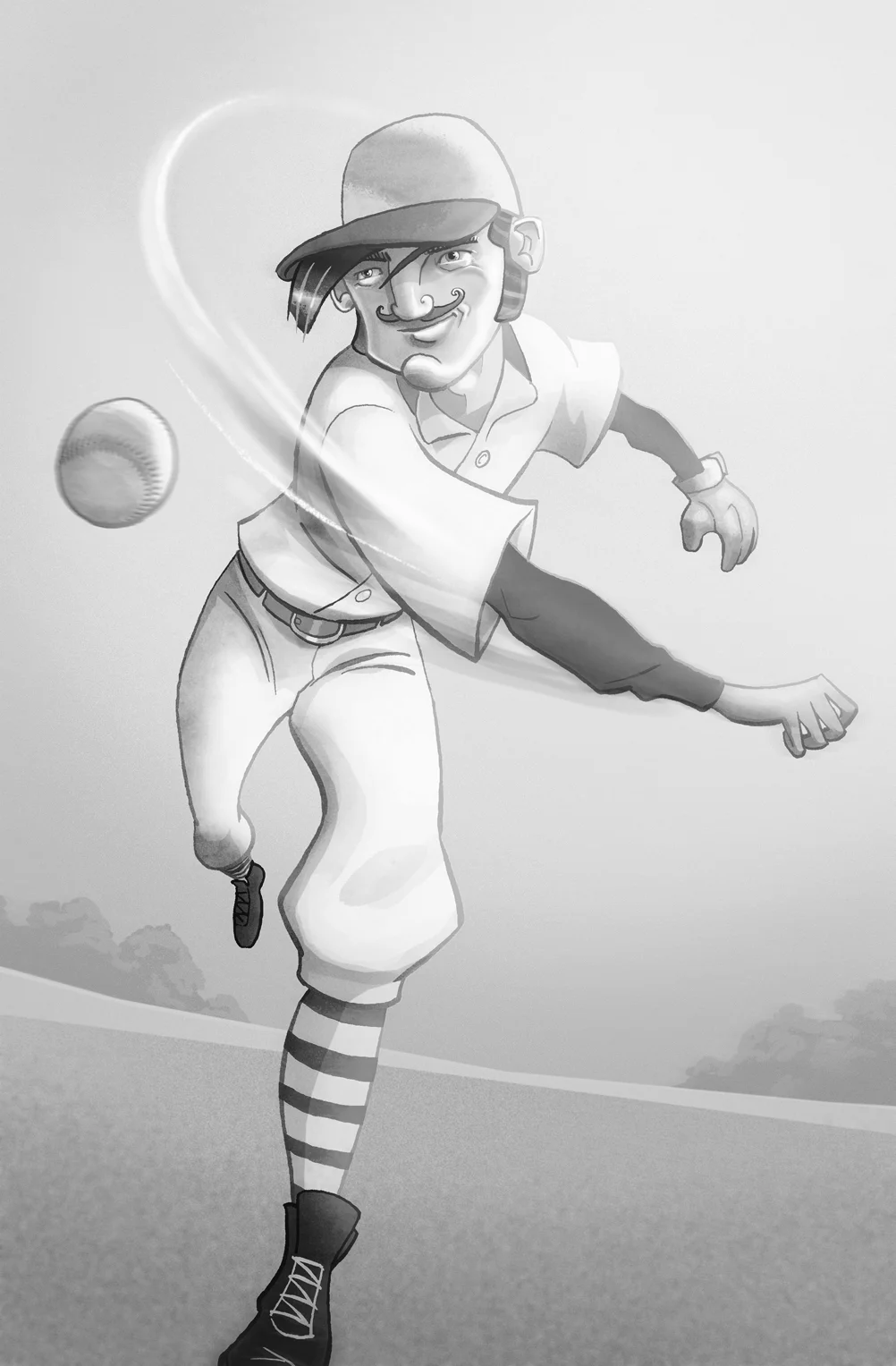
The theme to this week's artwork on Illustration Friday's weekly competition is vintage and my illustration submission is a baseball player done of course to look a bit vintage complete with a big old fashioned tash. Pen & ink illustration rendered by hand and then layered up and colour added on Photoshop to give it a nice grainy look. I wanted to get a nice bit of movement and perspective in the run up and throw in my character design.
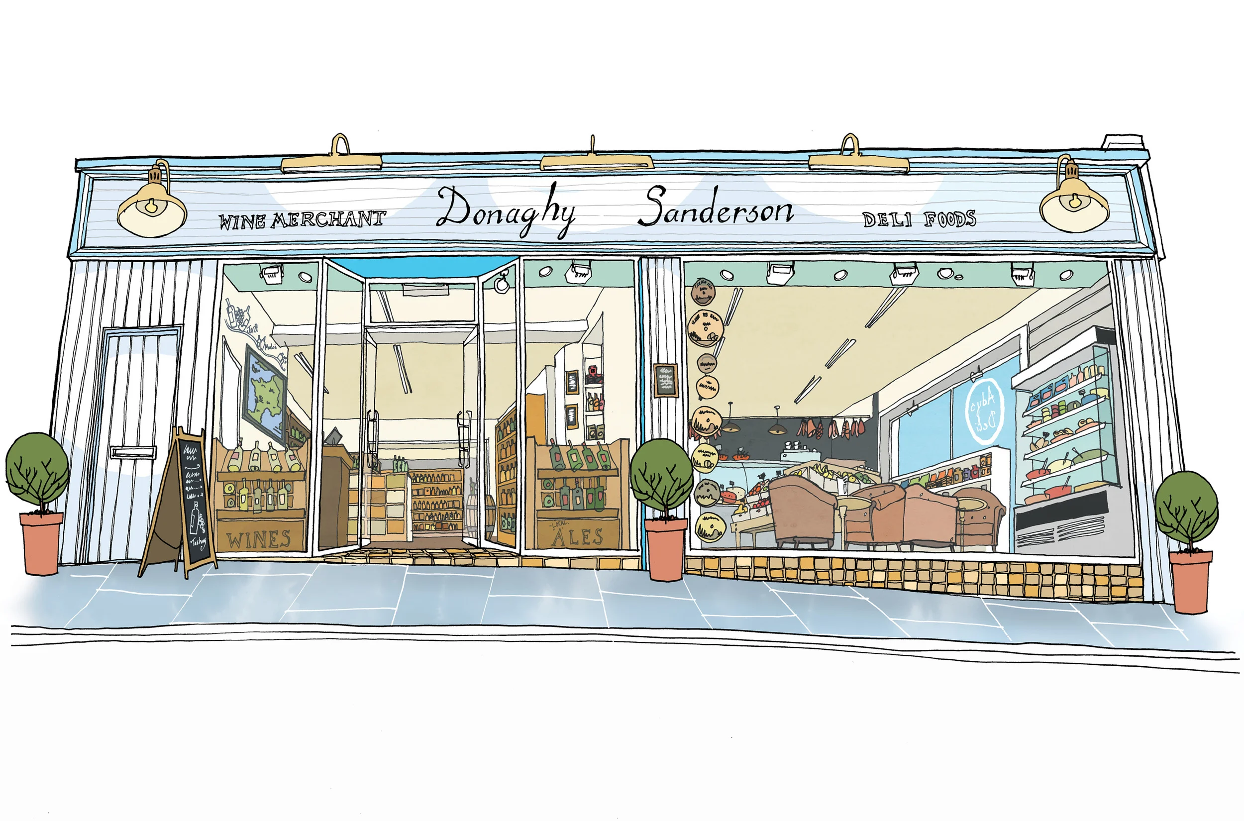
Shop front illustration for Donaghy & Sanderson for licence use. Hand rendered artwork in pen and ink.
Going Local
Promoting your small business especially when it’s brand new and you’re finding your feet is an exciting time and the passion really shines through when I’m talking to the client. I’m very happy to discuss and listen to their ideas and make suggestions working off their energy and helping make their business more visible.
It was a real pleasure to work direct with the owners of Donaghy and Sanderson, a local wine merchant and deli. While their business was being fitted out I was commissioned to create a shop front illustration. Having past experience of designing retail and licensed premises, it was simple to work off the floor plans and imagine the space as it would look when finished.
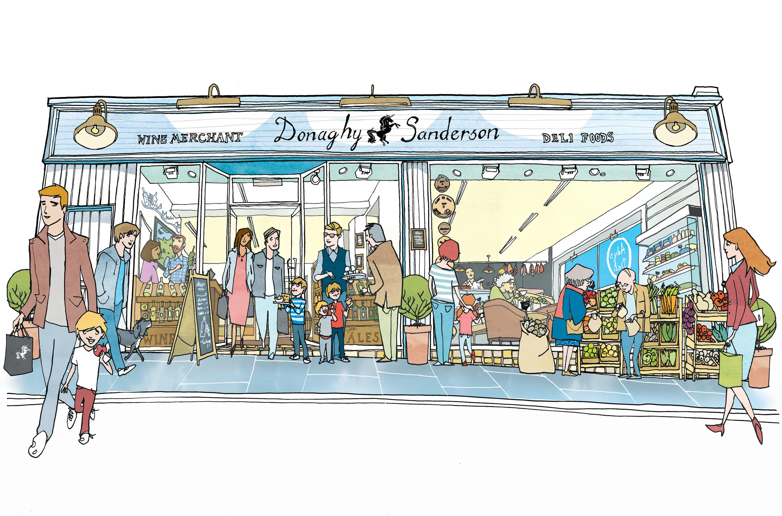
This illustration’s main purpose was for the license application and other promotions, so it was important to have the shop buzzing with activity and people going to and fro. I created the finished pen and ink illustration from the concept I developed and emailed over for approval. The line art illustration was kept a little tighter and for license use and using layers to create a more busy image with people and the shop’s produce so that they could be added in for the promotional illustration.
Creating a layered illustration so that you can adapt it for a client’s future needs is really important. To be able to quickly edit it keeps costs down for small and independent businesses. The same can be said of my branded illustration work for similar or large companies.
Exterior retail illustration for Donaghy & Sanderson for promotional use. The style is very similar to editorial illustrations I’ve done in the past for restaurant reviews.
Illustrating a Book Pt3 Working on Interior Illustrations
Hand drawn illustrations for the book are created on that old reliable medium of paper. By using layout paper for the roughs and developing revised drafts over the top you create layers or a history of development of that particular illustration. When doing the final illustrations in pen and ink I use better quality paper or board, scanning the artwork in then return to using layers in PhotoShop. Again it’s a process of building up the art, beginning with the pen and ink illustration and adding on top or below a new layer that adds to the picture.
Using layers this way gives so much control and the possibility of enhancing the illustration. The style of the artwork will inform the kind of treatment you give to your layers. Scanning in textures or washes and making the layer setting overlay can give the effect of a hand rendered wash when using software and another layer to colour the illustration.
The White Arrow Assassin by Tim Flanagan. Left to right: Pen and ink illustration on a layer, Next shows simple shading on a separate normal setting, Last is the texture this is an ink wash on good paper scanned in and set on an overlay layer on top of the shading layer.
Depending on the project this process can involve a few layers to achieve a simple hand rendered look of a line and wash illustration. More complicated illustrations can have many more, the line art can be on several layers and composited together from a foreground to background object or character. Colour added to each layer on a separate layer the line art on a multiplying layer setting so that the colour can be seen below. Textures and lighting added each to different layers to achieve depth, atmosphere and enhance any action in the scene.
It can sound complicated and I hope I did not make it sound like goobledygook! Practice and experience in pushing your skills and solving problems on the way will gives you the skills in confidently creating a layered illustration.
As a freelance illustrator with experience in creating book cover artwork, children’s book and picture book illustrations I create each artwork with the brief, story and finished product in mind. I’ve built up confidence in using layers to create the illustration, my top tip is to keep a master copy with layers to be able to edit or grab elements or characters to use elsewhere in the book. The back cover springs to mind as a place wherea ‘drop in’ works well as it always needs a little illustration to sit with the blurb. Building up the artwork in this way, having the experience in understanding how a book is promoted, the print process and digital release makes you a more valuable resource to the publisher/author. Having their confidence in your skills and professionalism as an illustrator will create further opportunity to collaborate with them again.


