Under the sea, Cover Artwork For the Little Mermaid Adventures

Creating a visually dynamic illustration for a front cover is always the result you want to achieve when starting the project.  For Twisty Tales, The Little Mermaid Adventures commissioned by Franklin Watts the challenge was creating a cover image before the work had started on the book interior illustrations. 

Through the process of roughing out the concepts for the interior you take your characters designs and get to know them better in the actions they take throughout the story.  The character design changes and adapts to the highs and lows of the adventure.  Little tweaks to the look can help express emotions better and it all helps with the narrative.  Doing the character design illustrations first for the book cover is not unusual as long as you know the story and the adventure the characters must face.

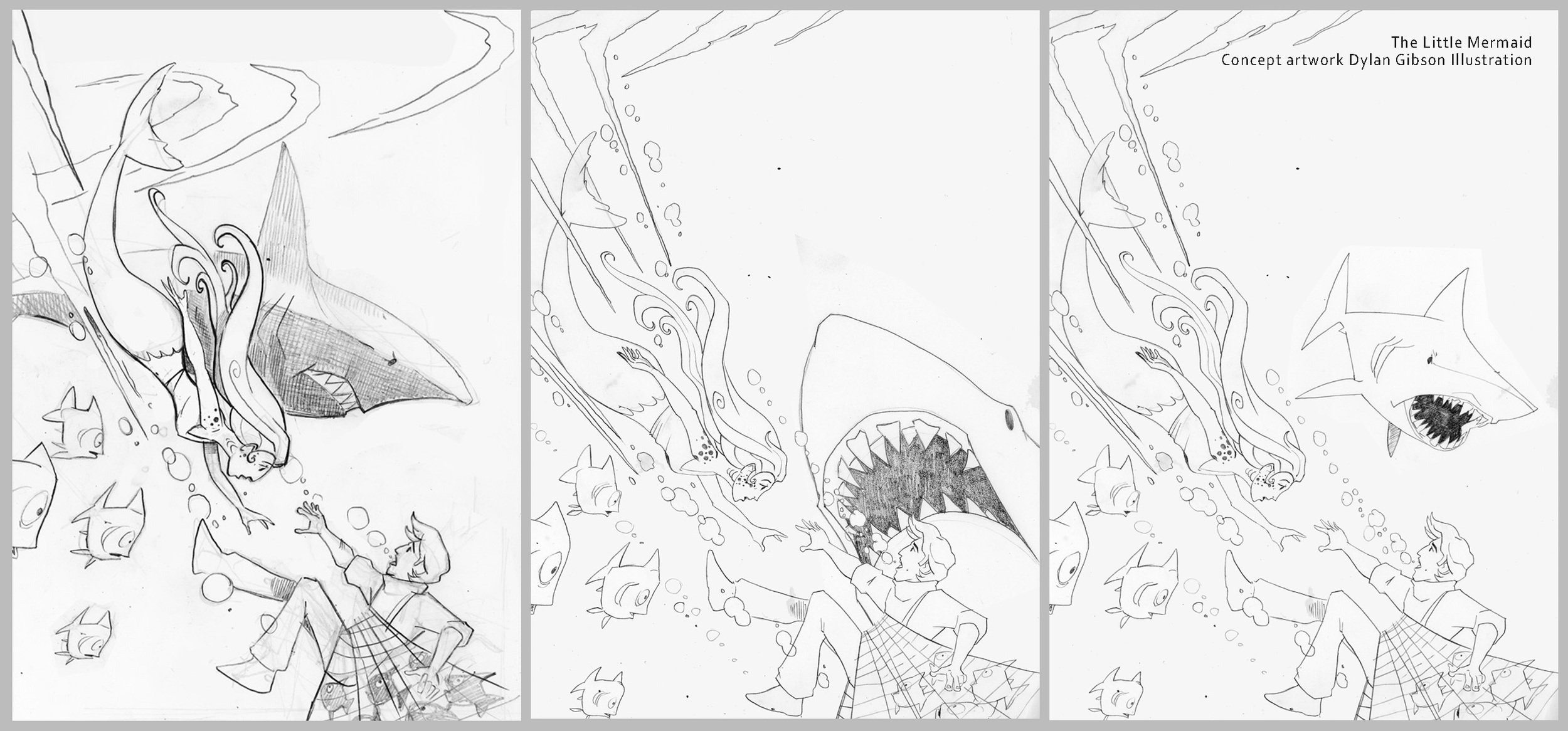
I develop my sketches in pencil and hand them over for review, keeping a good line of dialog going with the client and adapting the concept illustrations to fit with the feedback.  Ensuring a quick pace at this stage keeps helps the development and the input fresh so that the character doesn’t get overworked.  

Concept illustrations for the little mermaid.

Concept illustrations for the little mermaid.

Using the layout provided by the publisher I create the composition for the cover.  The little mermaid shoots through the artwork towards the sailor she is going to rescue.  It’s all very dynamic and has a comic book illustration tone to the layout as its very much a action scene with drama and danger that needs to be conveyed. 

There is no doubt from the layout that the man needs rescuing from drowning but an extra danger from a looming shark also needed to be shown.  Judging how prominent the shark should be was the main item to work out on the layout as the overall composition of the mermaid racing to help the sailor in the bottom corner was very well received.

Book cover illustrations showing the development of the composition.

Book cover illustrations showing the development of the composition.

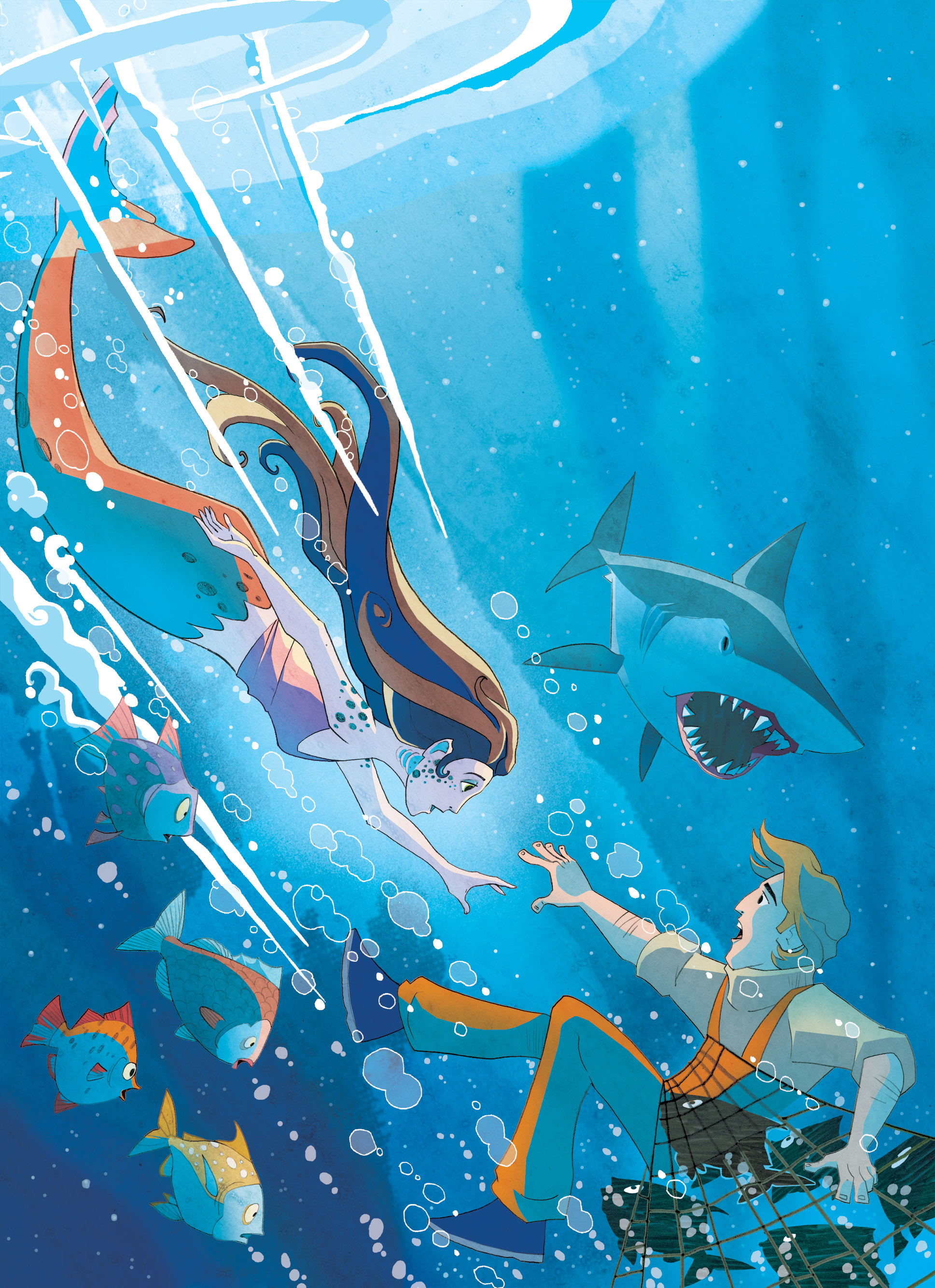
When it came to finishing the illustration and adding colour I wanted a little bit of the beauty of the underwater world to show, I thought of showing the plankton floating about like stars in a night sky with rays of light from the surface softly lighting the depths below.  With the little room I had left I wanted to show the little mermaids entourage of fish looking concerned at their brethren's plight in the net. 

Finished Book cover illustration

Finished Book cover illustration

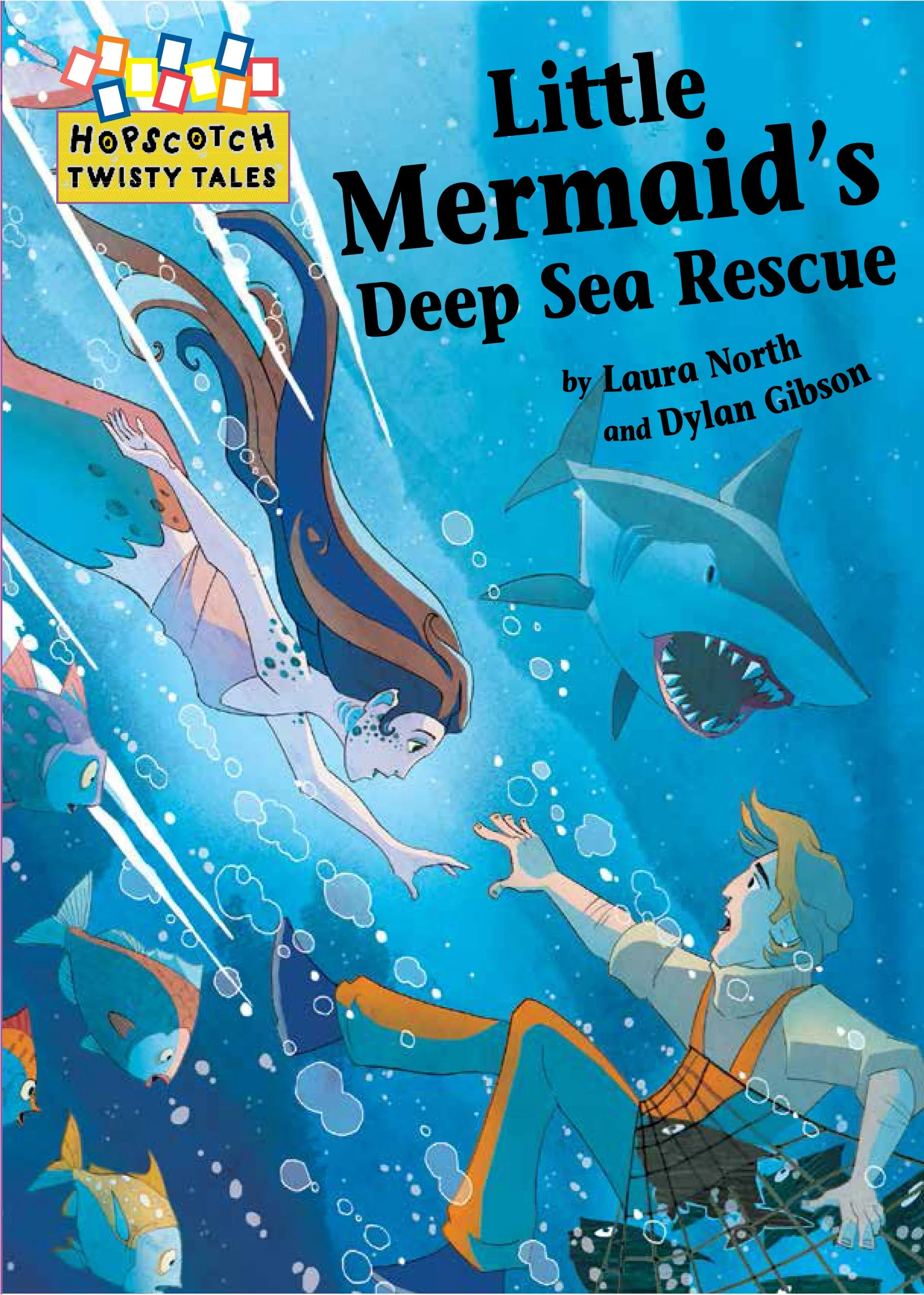
Cover Illustration with design.

Cover Illustration with design.

For other Picture Book illustrations, Illustrated stories and narrative illustrations please visit my galleries.  I have also reluctant reader illustrations and comic strip illustrations available to view or request samples of via my contact page.


Illustrating a Book Pt4 Working on the cover

Illustrating the cover shouldn’t be any different from drawing the artwork for the interior but is in many ways.  Firstly it’s an important factor in selling the book and has to represent what the story is about inone image, it has to illustrate the tone of the book whether its humorous, dramatic or an adventure story.  It needs to convey the genre maybe in an overt way or more subtlety, an example is a fantasy story with magic, monsters and strange lands that needs to be communicated on the cover to the potential reader.

Ways of illustrating this could be to show full on these fantasy elements with more recognisable details becoming secondary.  Another approach would be to ground the story showing the more approachable characters more prominently and the fantasy as a backdrop. As an artist there is maybe no right or wrong direction and it is more about responding to the story as a reader and interpreting it as a creative in the way you believe most fits the story.  As a freelance illustrator commissioned by an editor or author to create an artwork for the cover it’s a different matter as you will receive a brief or outline for you to interpret. The scope of what you can create will vary from project to project.  A tight brief is not a constraint to your imagination rather an opportunity, a creative response can be just as effective while working within set boundaries.

Normal
0


false
false
false

EN-US
X-NONE
X-NONE


 <w:LatentStyles DefLockedState="false" DefUnhideWhenUsed="true"
DefSemiHidden="true" DefQFormat="false" DefPriority="99"
LatentStyleCount="267">…

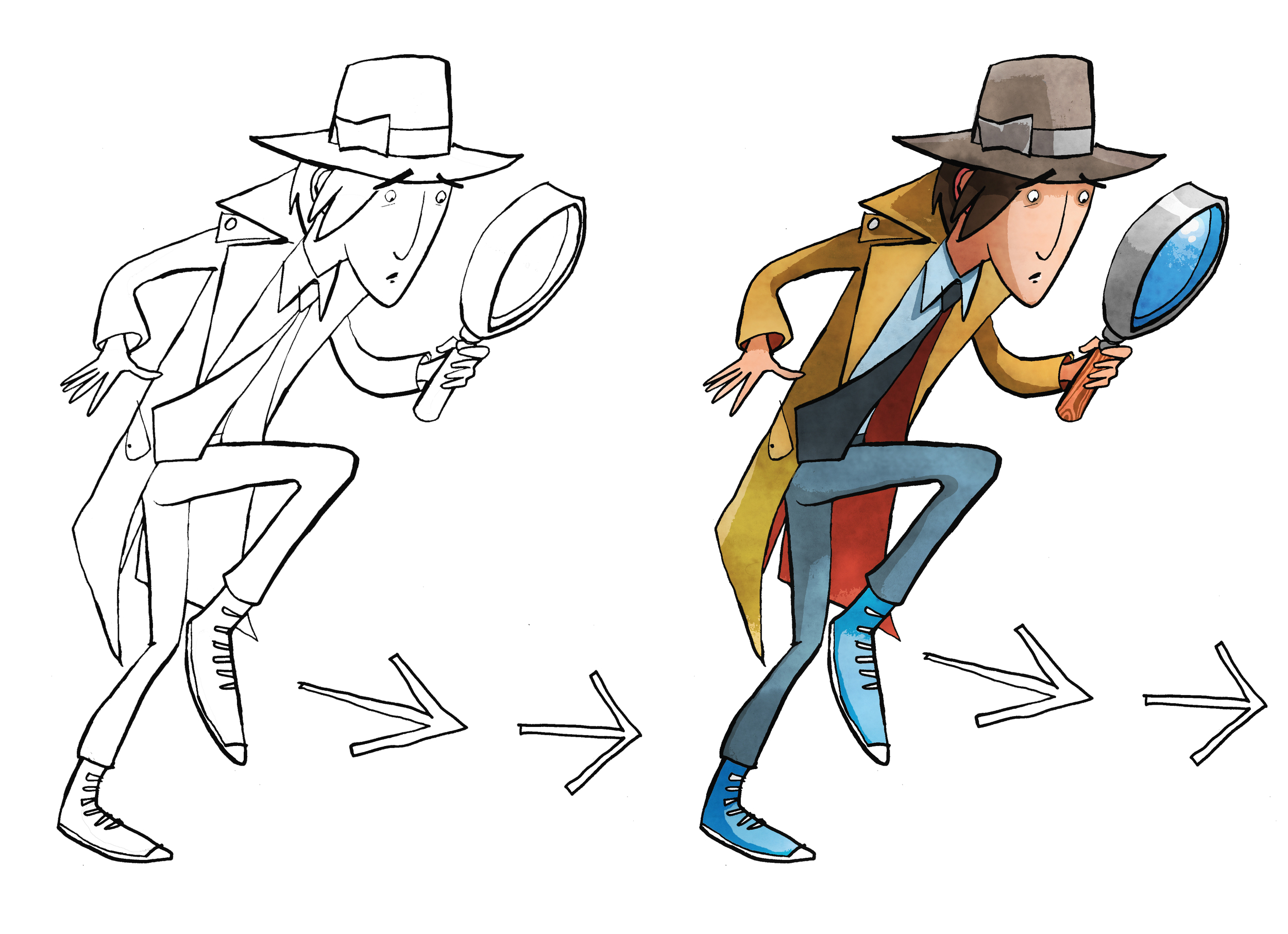
Cover Illustration rough and finished artwork for dropping into design.  Pen and ink using art pens,  dip pen and brush.  Illustration coloured on PhotoShop.


The book cover illustration for The White Arrow Assassin by Tim Flanagan was a rather simple brief to show the main character Private Investigator Lawrence Pinkley.  The character illustration was to be set on a coloured background with title and not include location or any scene from the book.  Visually there are a few ways that you can sell what he does on the front cover in a quick and effective way.  If you were to do word association with the description of detective a number of stereotypical answers about look and props would come your direction.  Using iconic imagery was key to sell the idea to audiences quickly.  As Pinkley’s look is typical of old gum shoe and noir detectives and his age is set down in the story, the boundaries are there to work within and the key challenge is representing by understanding his character in a quirky way.   He’s still new to the profession and out of his depth the humour in the story comes from his not understanding and inferring incorrectly from clues, resulting in the wrong deduction.  So when creating his character, a little bit of awkwardness in his physicality and stance goes some way in conveying this in the illustration.