I’ve recently been working with secondary school pupils at St Brides School in East Kilbride with Magic Torch Comics. For this project we are taking excerpts from children that fled Germany in the 1930’s and relocated to the UK.
Key to the learning is to allow the pupils to find their own way through the story and share my experience of illustrating graphic novels. To get them infer from a story’s text, what else could be said and making their own choices in how to best visually tell the tale. .
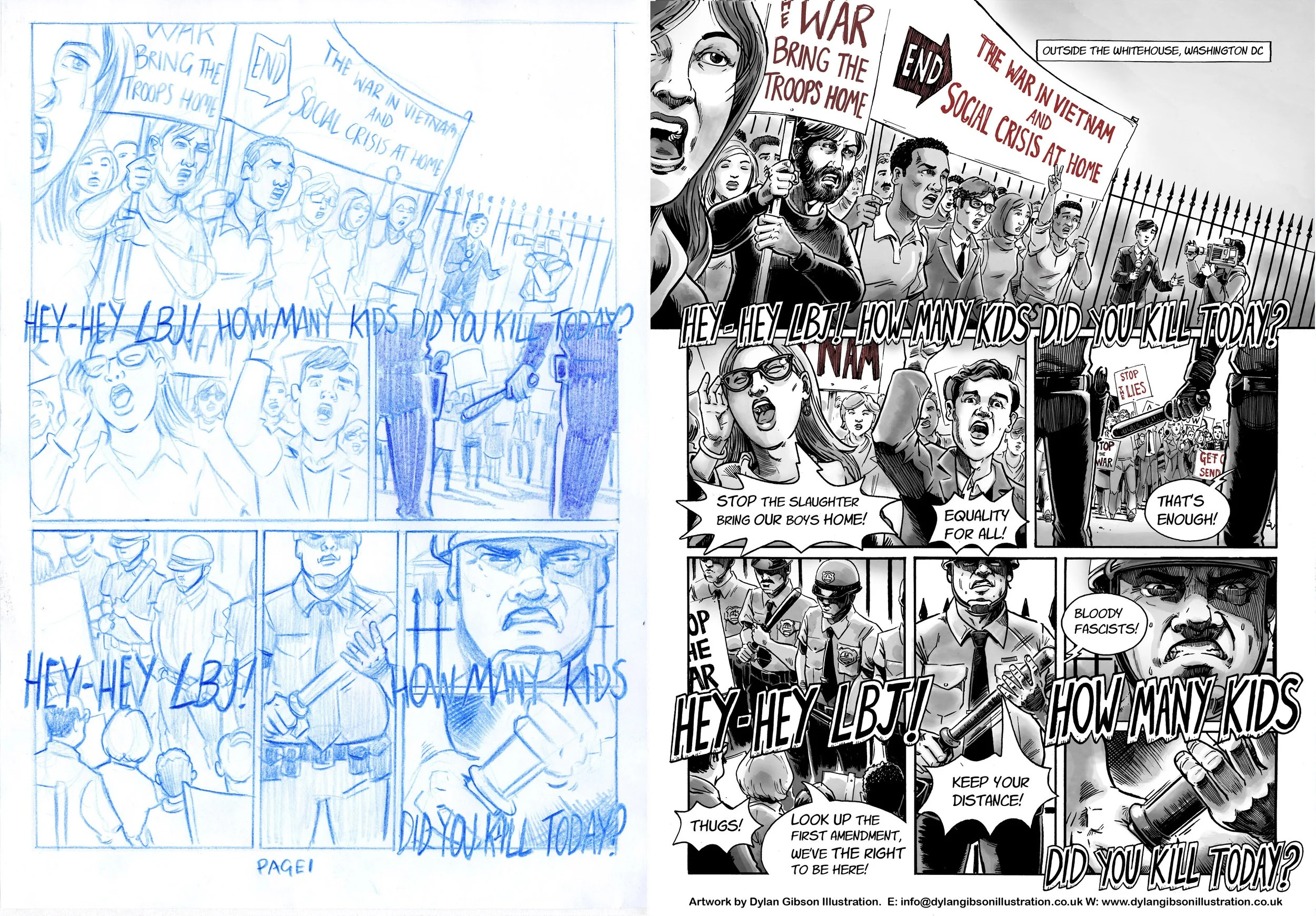
The short version of Isi Metzstein’s account of how he experienced Kristallnacht was prepared to work with. The two pages you see here have been inspired in part from the classes own work. In my most recent session with the class my two pages inspired from the collaboration was presented to them for feedback.
As the project progresses I will be creating the full version of this story and a another by Dany Metzstein. These stories told as visual narratives will be an important part in telling these important stories to younger people.
Both will be available to read for free at Magic Torch Comics for schools and anyone else interested.
These interviews can be found here and tell of the horror inflicted on these young lives.