Casting your graphic novel

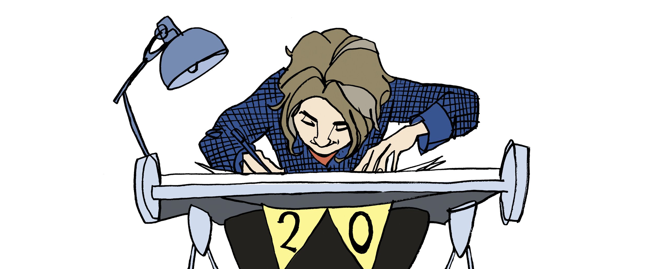
When I get a story to illustrate, I read through the story and my mind takes me places, I imagine the environment and characters form the text and start to populate that world with characters.

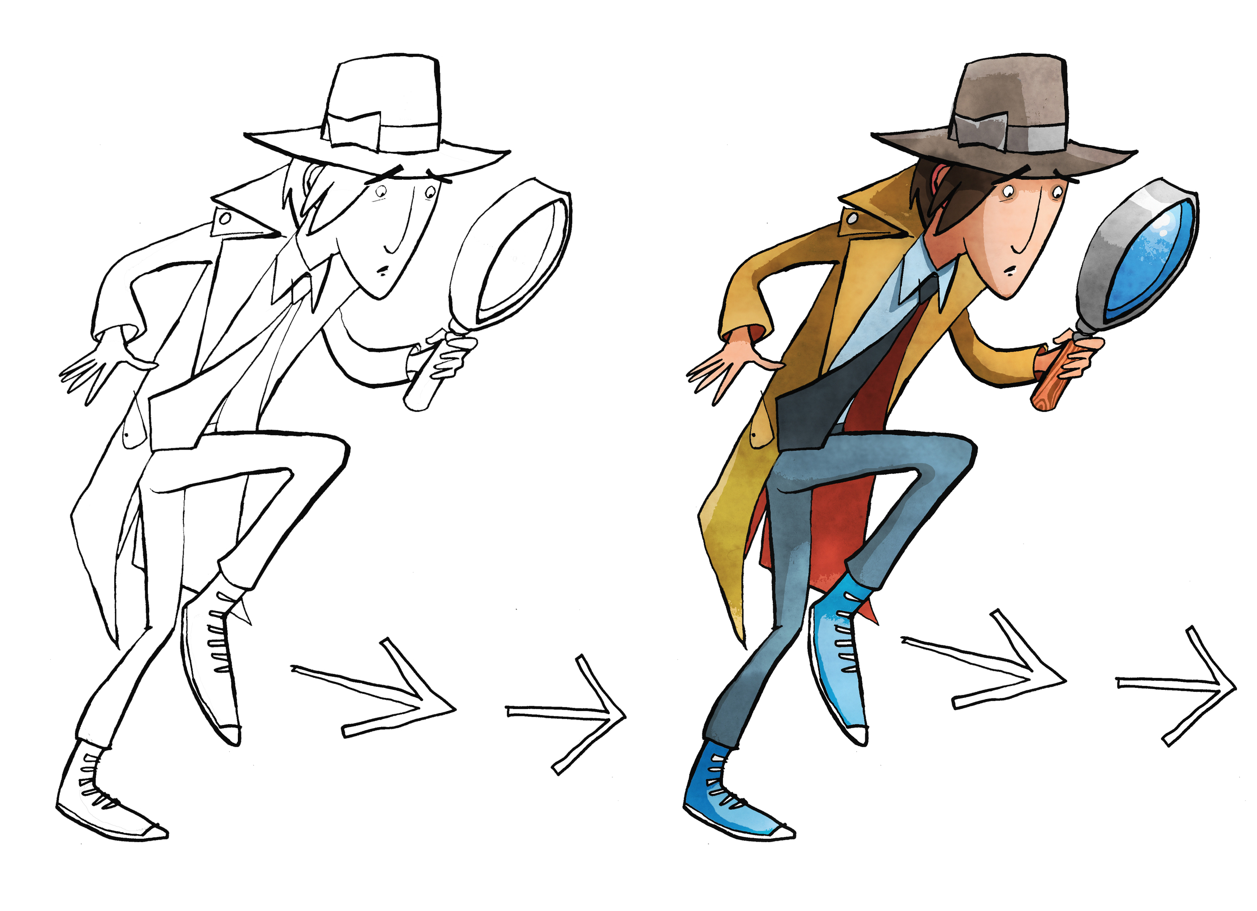
If designing the world is a mixture of research, location, set building, dressing and prop making. Then creating the people that live there is like casting, only you draw not chose your actors.

These are character designs first laid down in pencil and then inked to cast the young boy first at about 8 years old then as a young teen for a story set early 1800’s

Once the casting is in place then its a matter of getting them to act, as in when I draw the story panels that feature the character reacting to the world around them.

Plasto A New Character Design for The Sustainables Academy

This fellow is a happy chap and he’s also one of the Sustainables. This character forms part of a range of illustrated characters created for a exciting range school resources to educate on environmental issues and matters of responsible consuming. Plasto represents plastic use and recycling and as you can see has a bendable and stretchable physicality to him.

Clients wanting to commission usually present an idea and from that a conversation and then rough drafts follow to develop the idea further. I’ve attached a later pencil draft to show what a final concept looks like and how closely it looks to the final presented to the client.

Narrative Storytelling And Working With Schools

I’ve recently been working with secondary school pupils at St Brides School in East Kilbride with Magic Torch Comics. For this project we are taking excerpts from children that fled Germany in the 1930’s and relocated to the UK.

Key to the learning is to allow the pupils to find their own way through the story and share my experience of illustrating graphic novels. To get them infer from a story’s text, what else could be said and making their own choices in how to best visually tell the tale. .

The short version of Isi Metzstein’s account of how he experienced Kristallnacht was prepared to work with. The two pages you see here have been inspired in part from the classes own work. In my most recent session with the class my two pages inspired from the collaboration was presented to them for feedback.

As the project progresses I will be creating the full version of this story and a another by Dany Metzstein. These stories told as visual narratives will be an important part in telling these important stories to younger people.

Both will be available to read for free at Magic Torch Comics for schools and anyone else interested.

These interviews can be found here and tell of the horror inflicted on these young lives.

Illustrating a Book Pt4 Working on the cover

Illustrating the cover shouldn’t be any different from drawing the artwork for the interior but is in many ways.  Firstly it’s an important factor in selling the book and has to represent what the story is about inone image, it has to illustrate the tone of the book whether its humorous, dramatic or an adventure story.  It needs to convey the genre maybe in an overt way or more subtlety, an example is a fantasy story with magic, monsters and strange lands that needs to be communicated on the cover to the potential reader.

Ways of illustrating this could be to show full on these fantasy elements with more recognisable details becoming secondary.  Another approach would be to ground the story showing the more approachable characters more prominently and the fantasy as a backdrop. As an artist there is maybe no right or wrong direction and it is more about responding to the story as a reader and interpreting it as a creative in the way you believe most fits the story.  As a freelance illustrator commissioned by an editor or author to create an artwork for the cover it’s a different matter as you will receive a brief or outline for you to interpret. The scope of what you can create will vary from project to project.  A tight brief is not a constraint to your imagination rather an opportunity, a creative response can be just as effective while working within set boundaries.

Normal
0


false
false
false

EN-US
X-NONE
X-NONE


 <w:LatentStyles DefLockedState="false" DefUnhideWhenUsed="true"
DefSemiHidden="true" DefQFormat="false" DefPriority="99"
LatentStyleCount="267">…

Cover Illustration rough and finished artwork for dropping into design.  Pen and ink using art pens,  dip pen and brush.  Illustration coloured on PhotoShop.


The book cover illustration for The White Arrow Assassin by Tim Flanagan was a rather simple brief to show the main character Private Investigator Lawrence Pinkley.  The character illustration was to be set on a coloured background with title and not include location or any scene from the book.  Visually there are a few ways that you can sell what he does on the front cover in a quick and effective way.  If you were to do word association with the description of detective a number of stereotypical answers about look and props would come your direction.  Using iconic imagery was key to sell the idea to audiences quickly.  As Pinkley’s look is typical of old gum shoe and noir detectives and his age is set down in the story, the boundaries are there to work within and the key challenge is representing by understanding his character in a quirky way.   He’s still new to the profession and out of his depth the humour in the story comes from his not understanding and inferring incorrectly from clues, resulting in the wrong deduction.  So when creating his character, a little bit of awkwardness in his physicality and stance goes some way in conveying this in the illustration.