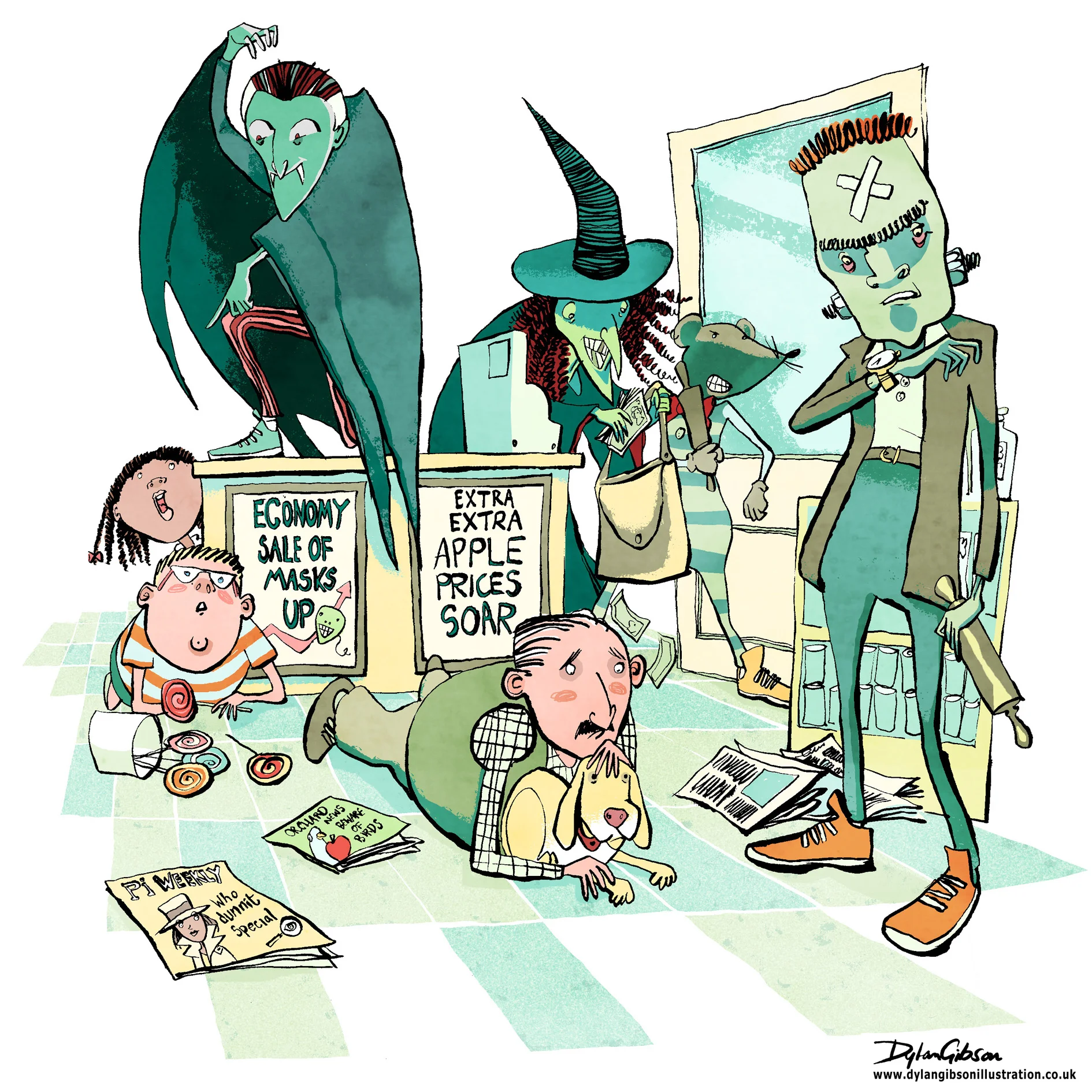
Imagine a robbery at a newsagents and all manner of scary thoughts cross your mind, the potential for someone to get hurt, weapons, dangerous assailants and theft. When illustrating a scene like that in a children’s book you have to step carefully. Even when the tone of the book is funny you have to consider making the scene look dangerous and dramatic without having the illustration look too violent or scary. At the same time you have to give the artwork a little edge as to not belittle how terrifying a robbery can be. Performing a illustrated balancing act worthy of a trapeze artist starts with laying out the essential elements from the story and composing a layout.
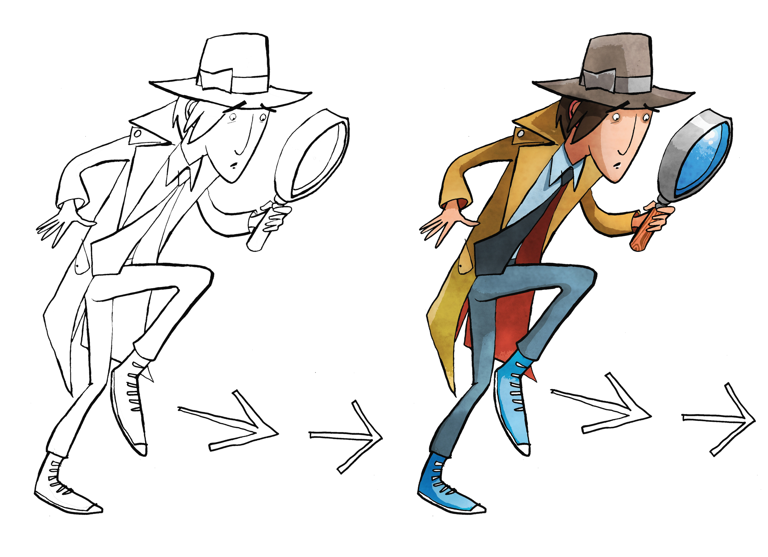
Creating a good concept illustration is key to developing the right tone and I’ll do that by taking a very rough sketch and using layout paper just go over it again until I get character, composition and tone the way I want it. Getting it right at this stage means no later disappointment from the publisher by keeping the intention of the approved signed off concept in line with how the finished image will look like.
My Pen and Ink illustration for the Halloween Bandits
For my robbery scene, illustrated in pen and ink, I added in a few bystanders, a man protecting his dog, and a boy next to a jar of lollipops. It really helps of course that my robbers were wearing Halloween masks and that alone helps keep the look fun, dramatic and not too scary.

