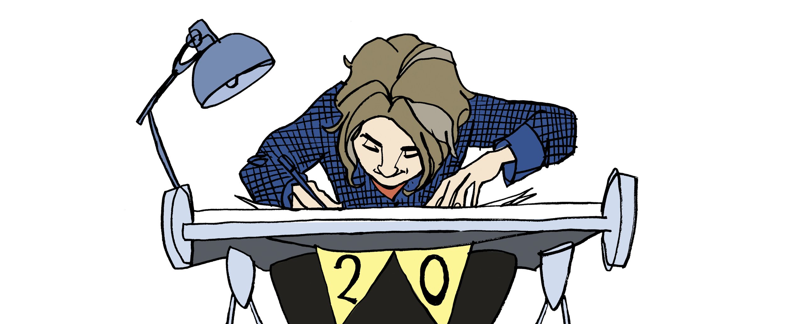
Hand drawn illustrations for the book are created on that old reliable medium of paper. By using layout paper for the roughs and developing revised drafts over the top you create layers or a history of development of that particular illustration. When doing the final illustrations in pen and ink I use better quality paper or board, scanning the artwork in then return to using layers in PhotoShop. Again it’s a process of building up the art, beginning with the pen and ink illustration and adding on top or below a new layer that adds to the picture.
Using layers this way gives so much control and the possibility of enhancing the illustration. The style of the artwork will inform the kind of treatment you give to your layers. Scanning in textures or washes and making the layer setting overlay can give the effect of a hand rendered wash when using software and another layer to colour the illustration.
The White Arrow Assassin by Tim Flanagan. Left to right: Pen and ink illustration on a layer, Next shows simple shading on a separate normal setting, Last is the texture this is an ink wash on good paper scanned in and set on an overlay layer on top of the shading layer.
Depending on the project this process can involve a few layers to achieve a simple hand rendered look of a line and wash illustration. More complicated illustrations can have many more, the line art can be on several layers and composited together from a foreground to background object or character. Colour added to each layer on a separate layer the line art on a multiplying layer setting so that the colour can be seen below. Textures and lighting added each to different layers to achieve depth, atmosphere and enhance any action in the scene.
It can sound complicated and I hope I did not make it sound like goobledygook! Practice and experience in pushing your skills and solving problems on the way will gives you the skills in confidently creating a layered illustration.
As a freelance illustrator with experience in creating book cover artwork, children’s book and picture book illustrations I create each artwork with the brief, story and finished product in mind. I’ve built up confidence in using layers to create the illustration, my top tip is to keep a master copy with layers to be able to edit or grab elements or characters to use elsewhere in the book. The back cover springs to mind as a place wherea ‘drop in’ works well as it always needs a little illustration to sit with the blurb. Building up the artwork in this way, having the experience in understanding how a book is promoted, the print process and digital release makes you a more valuable resource to the publisher/author. Having their confidence in your skills and professionalism as an illustrator will create further opportunity to collaborate with them again.


