Promoting your small business especially when it’s brand new and you’re finding your feet is an exciting time and the passion really shines through when I’m talking to the client. I’m very happy to discuss and listen to their ideas and make suggestions working off their energy and helping make their business more visible.
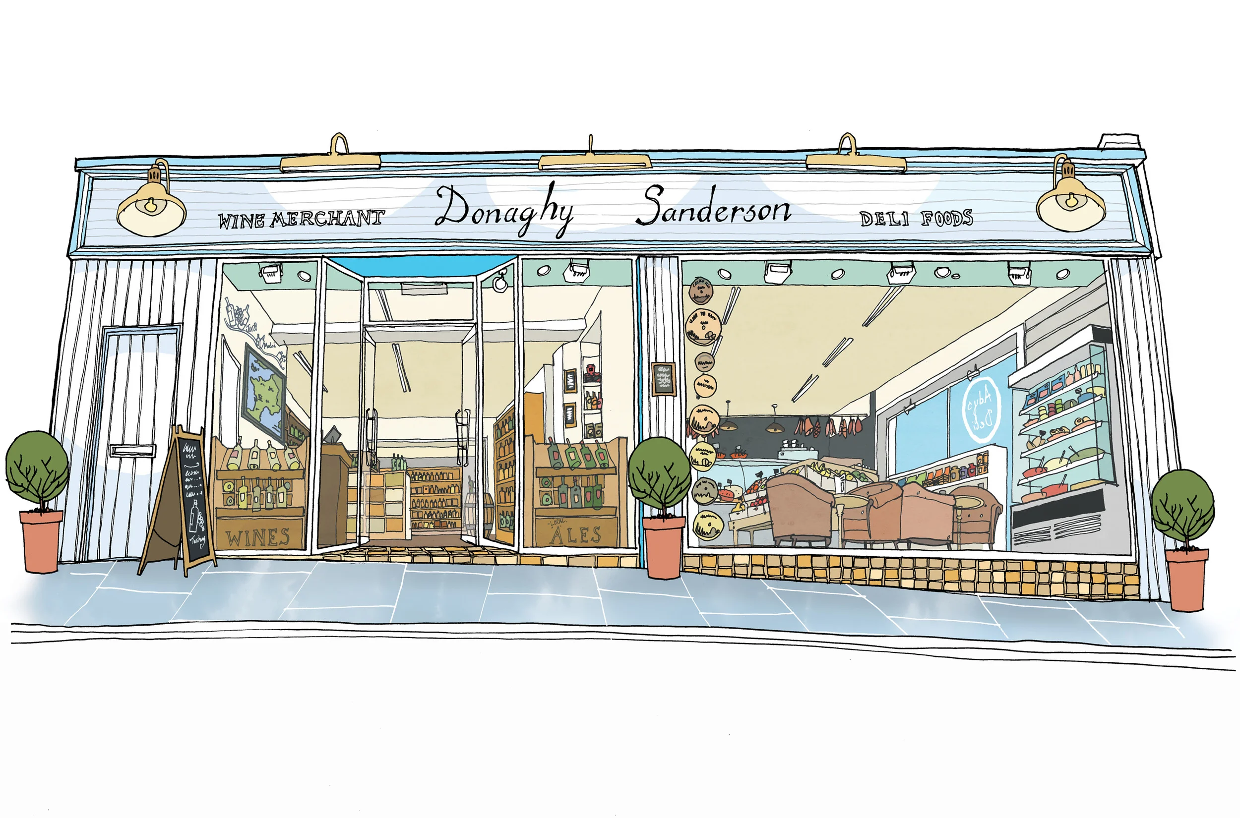
It was a real pleasure to work direct with the owners of Donaghy and Sanderson, a local wine merchant and deli. While their business was being fitted out I was commissioned to create a shop front illustration. Having past experience of designing retail and licensed premises, it was simple to work off the floor plans and imagine the space as it would look when finished.
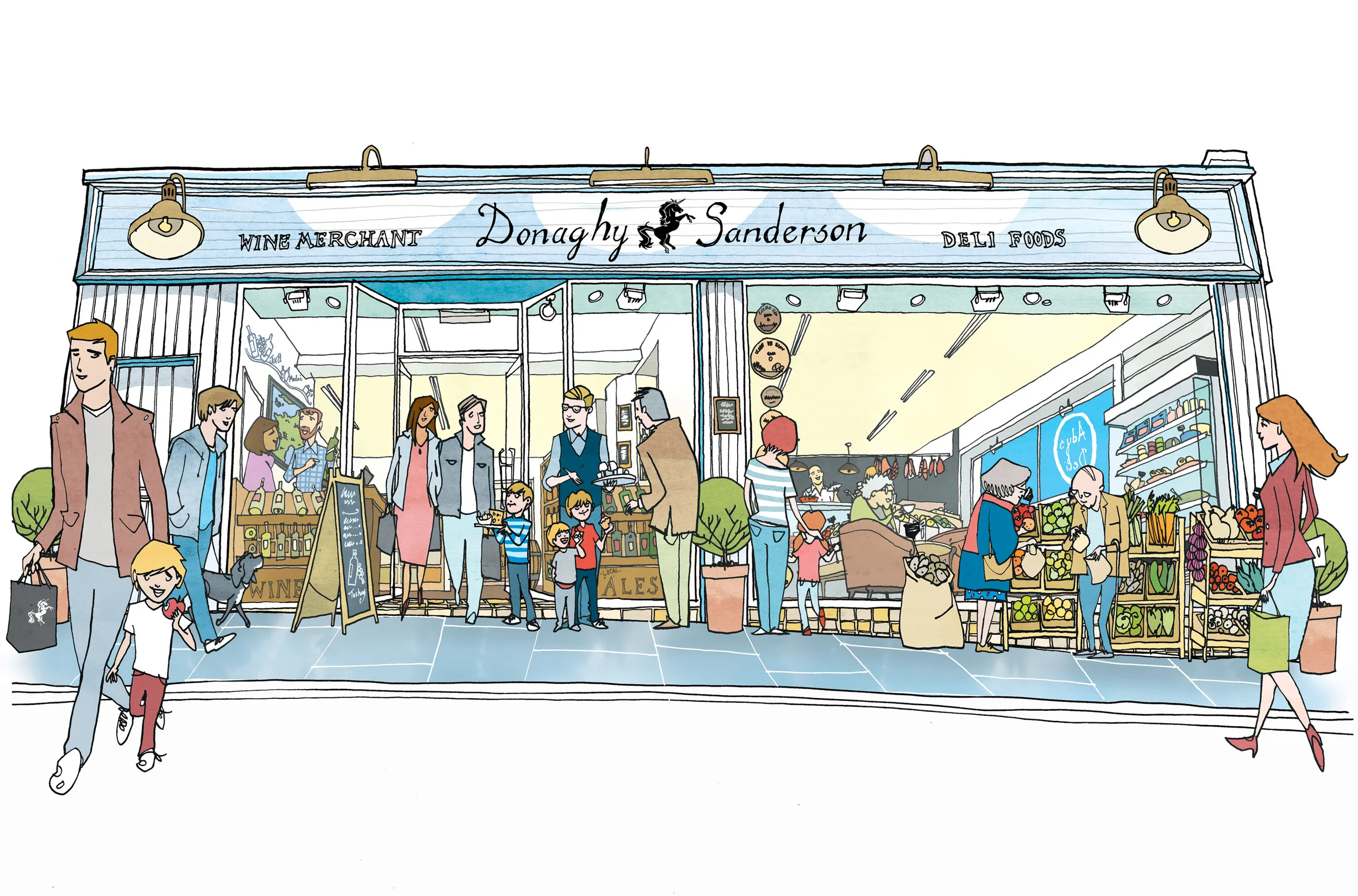
This illustration’s main purpose was for the license application and other promotions, so it was important to have the shop buzzing with activity and people going to and fro. I created the finished pen and ink illustration from the concept I developed and emailed over for approval. The line art illustration was kept a little tighter and for license use and using layers to create a more busy image with people and the shop’s produce so that they could be added in for the promotional illustration.
Creating a layered illustration so that you can adapt it for a client’s future needs is really important. To be able to quickly edit it keeps costs down for small and independent businesses. The same can be said of my branded illustration work for similar or large companies.
Exterior retail illustration for Donaghy & Sanderson for promotional use. The style is very similar to editorial illustrations I’ve done in the past for restaurant reviews.


